Insights
Our end of the design business is boutique by nature. The word “boutique” means a small specialty shop. And while we design projects from large, grand and elaborate hotels and premier residences, we like to feel that we too are a specialty shop. You get individual, personalized service, and especially custom, unique designs. For this we depend upon not only on our firm’s talented staff, but a host of remarkable resources that we have found over the years. We have developed a great rapport between these owners and artisans and can call on them to produce elements for our projects that can be found nowhere else. We’ll give you glimpse into some of them for you here. A few of them are even local to Sarasota, and others work for us from around the country to across the seas. When we were working on the designs for The Concession, the prestigious new golf resort here, we commissioned a series of custom light fixtures and even casegoods from a great company in Los Angeles. Paul Ferrante has been fabricating specialized lighting, some of it replicating antique fixtures. They have developed over the years a group of talented international artisans from Europe, Mexico and the United States, who have learned or brought with them, skills that are fast disappearing. They can shape metal and glass, they can finish it with a high polish, or a soft and alluring patina. They can carve wood and copy an antique (if we need more than one). And they do it all with great elan and care. They are easy to work with and produce elements that transcend the merely functional into charming and attractive objects. Another great resource we used at The Concession is Woven Legends. This company is a treasure. They are located on the east coast, but their workrooms are half a planet away. They make hand-knotted rugs in a time-tested and traditional manner. What is unique is that we can work with them to make traditional patterns - which we can expand or shrink to suit the size of the rug and color them to suit our palette. After we have done our design work with them, they transmit the specified designs and colors electronically to Turkey where the information is taken by motorbike out into remote villages. Here, local craftswomen sit at ancient looms, just as they have for centuries, and tie knots by the thousands. The result is a series of glorious rugs that will be heirlooms to be treasured by the next generations of Club members. On a smaller scale, we have an artist in steel, Thomas Clarkson, who can make delicate looking flowers out of wrought iron. His anvil is in Atlanta and his work for us includes fireplace screens - either handsomely classical, or with whimsical local references, like shells and sea creatures. They make a wonderful and subtle touch at the hearth. Closer to home, we often call on Bill Hartman of the William Hartman Gallery on Palm Avenue. He provides professional and careful framing for many of the fine art procurements we make for our clients. Working with Bill is easy; he has the resources and a great eye along with the experience, which makes the process a pleasure. He also now has a great trove of vintage photographs of “old Sarasota” that are a great find. So, all this talk of boutiques has put me in a shopping mood, so off to the pleasures of searching for a treasure for a bargain.
Previously, I wrote about the art of framing. Now, after spending a few weeks searching the art markets for clients, it seems appropriate to write about the selection and purchasing of art. The phrase, “Beauty is in the eye of the beholder,” is never as true as it is with art. Even educated and totally knowledgeable art critics can have different views on a particular piece of art. Sometimes art is selected because the viewer sees it as pleasant, calming, beautiful, technically well-produced, shocking, avant-garde, valuable, or as a good investment for resale. All of this art can be “good”, if it is simply selected due to personal preference or intent. Generally, the person who is new to art will select a piece that is pleasant or beautiful. They may not know the techniques used or even care; they just like the art for its decorative value. This is wonderful – art should be a part of everyone’s life whether one is an art expert or not. Some collectors like avant-garde art which can often be outrageous, sometimes arousing, or simply something new. Some of this avant-garde art is not understood by either the novice or the professional. But it is a new expression and often offers us a new way of looking at something mundane or “everyday”. New expression is good. Often it leads to greater and more accomplished expression. This point is easy to illustrate especially with the contemporary art of the sixties and seventies. Lots of canvases were painted, some just all white or of another color, and lots of stripes (The Washington Color School) or splatters of paint (a la Jackson Pollock and Clifford Still). It is easy to say, “I could have done that,” and lots of us could have. But, the artists did it first, and by doing it first, got credit for starting the trend, helping us see things in a new way. Then there is intellectual art, which can easily fall into the avant-garde category. Intellectual art is a thoughtful and deep manifestation by the artist which some people can comprehend and others cannot. Often, it is understood by studying or knowing the artist, so one can appreciate the elements of the art and what the artist is trying to convey. In the upper echelons of art, technique becomes more important. Old Masters are celebrated because of breakthroughs in technique or style for their era. For instance, Vermeer used light in a new way, Renoir was a leading painter in the development of the Impressionist style, and Picasso is known for his founding role in the Cubist movement. There is endless advice on why and how to buy art. Some people believe that art gains value when it changes hands, so there is the investment angle. Others say to buy art that challenges you, buy what makes you feel good or buy from artists you admire or know. My advice is: buy the best art you can afford for whatever your strategy or for whatever your reasoning happens to be. Buying art, and having art, enhances your daily life, supports the community of artists and art dealers, and opens up your world. And artists are fun and interesting people! The next time there is an art opening, take advantage of this wonderful social, intellectual, and eye-opening experience. Go and enjoy! Visit studios, open the lines of communication with artists and dealers, and get involved. It is great fun, stimulating and who knows! Maybe you’ll come home with the next Picasso or Renoir!
In an earlier article, we wrote about all things that speak of our beloved Florida: glorious sky and sand, lush flowers and foliage, striking sunsets and sunrises, and most importantly, our beautiful and abundant waters. Almost everywhere that one drives, bikes or walks in this beautiful state, we are blessed with incredible water views. It is an element that makes Florida so special and unique, and which instantly relaxes the visitor as well as the long-time resident. We’ve talked about how, in our work, we like to celebrate the place we’re in. So how does one celebrate our gorgeous Florida water views and vistas? We do it in several ways. First of all, whenever we’re designing on or near the water, our focal point is always the view. Window treatments, if used at all, frame the windows and rarely cover the glass. Furniture is low or pulled back from windows, allowing a closer look. With a beautiful view, one is naturally drawn to it. So, our space planning insures easy access to windows and especially doors. Color is so obviously important when working with water. Exquisite water offers us an infinite palette, changing as to the time of day, weather and light. Capturing the sparkling azure blue, clear aquamarine and effervescent sea green hues is essential. We accomplish this by using fabrics that echo the water tones, keeping patterns minimal and subtle, and using texture to create interest. Our belief is that nothing in our design should compete with the water, but rather only enhance it. Wall and ceiling color is important also. Soft neutrals and creamy whites mimic the gentle tones of sand and beach, allowing the aqueous colors to be played out in the fabrics and other furnishings. A light palette speaks of warmth, and a casual, open and easy mood. Flooring is usually a large element in any design. Again, a soft, light and casual mood is appropriate. Honed stones with a matte finish,”tumbled” marble and gently sanded wood speaks of the beach and a relaxed atmosphere. So what about the sky? We all know how the color of the sky is reflected in the water. And, needless, to say, our Florida skies can be as exuberant as Chagall or Monet. Look for sensational lavenders, bright white in clouds, and breathtaking, palest turquoise spectrums. Grab these spectacular hues and use them in art and accessories to further engage our magnificent surroundings in your own personal environment.
It is amazing how intertwined art is with design. The two words are almost synonymous. Previously, I’ve written about buying art and how to frame it, and we have published numerous articles about various facets of design. In this article, I’d like to write about having art actually created on the surface of our interiors: truly blending art with design. We have long been an admirer and proponent of painted surfaces and have often used artists and craftsmen to embellish limited surfaces of a home. Like most things, if overdone, they lose their impact. So when we have used them to make a statement, we surround them with more subtle surfaces; when we use them more prolifically, we make them more background, using less bold tone-on-tone glazes and finishes. The menu of painted surfaces and techniques is vast, varying from simple glazing; to stippling and sponging; applying metallic leafing; and painting murals or designs on the wall or ceiling. Other techniques include venetian plaster which is a special plaster material incorporating finely ground marble to give a surface that is almost as smooth as glass, yet has the look of some dimension and the mark of the craftsman’s trowel throughout. Here are a few examples of what we have done to demonstrate these techniques. We recently had a client that adored embellished surfaces. So almost every surface of the home has some sort of applied special paint finish, even all the baseboards, floor casings and crown mouldings. In order to do that amount of work we had to make sure the painting was subtle and added nuance and elegance, and that the surfaces did not compete with one another. So, we had artisans do a gentle strie technique which involves painting a glaze onto the already painted base, door casing and trim, and then dragging a dry brush through the glaze to give it direction and a vague texture. We even had them mask the various boards of the door casing and wainscoting so that the vertical boards have a vertical strie and the horizontal boards have a horizontal strie. It is subtle, of course, but it almost unconsciously informs the eye of the nature of the trim and wainscot, giving a richer environment. It doesn’t shout at all, and from across the room is not noticeable, yet as you walk down the hall and your hand and eye touch the casing or chairrail, you have a little “aha” that says someone took some special care and attention here. It is very lovely. For yet another project, we are having a venetian plaster applied to a vaulted ceiling in a large vestibule between the great room and the foyer. It has a detailed moulding at the perimeter of the curving ceiling surface where it meets the walls, but the ceiling itself will have a lovely sheen almost like a rich damask. The color is tone-on-tone so it too adds detail without clamour. At The Cloister at Sea Island, we designed cast plaster shapes on the ceiling of the library. Then we painted, glazed and stenciled the shapes to give the look of Renaissance plaster. The embellished surface then gained the luster and glow that comes with age. Something totally glamorous that we have done is applying an ethereal mural to a single wall in a small room whether it be a bath, powder room or dressing area. On one project, the artist painted a wall with a gradual shading, starting with a soft yellow at the ceiling and descending to a more pronounced gold at the base. On this was painted a graceful branching of forsythia with delicate leaves and clusters of voluptuous blossoms cascading. This room may have been small, but it was bursting with character and charm. For a bar area at one of the larger homes we have designed, we had artisans stencil rugged dark beams with a low contrast design. The pattern was a series of scrolls and leaves of a dark fern green and muted ochre that blended well with the grain of the wood, but did not jump to the eye. Another way we used venetian plaster was on the walls of the entrance foyer at The Concession, an extremely elegant golf club in Bradenton, Florida. When entering The Concession, one passes through heavy mahogany double doors into a foyer with a double vaulted ceiling. The feeling of spaciousness and grace is as if one has entered a lovely Tuscan villa. The subtle beige of the venetian plaster walls adds to this image of rich elegance. As you can see, the variety and palette is essentially infinite. It’s part of what makes our work so much fun and interesting- we like using the broad spectrum of fabrics, materials and the talent of artisans to customize the homes of our clients. The embellished surfaces truly blend art with design, and we are all richer for it.
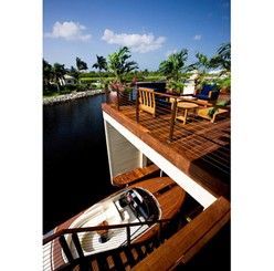
What could be more fun than having a house on one of our many beautiful Sarasota waterways and having a boat with the house as well? Well, not much, as long as the house is in Sarasota, Palm Beach, Naples or some other gorgeous locale. On this theme, I thought it would be entertaining to write about a project we completed in the British West Indies. The project is 19 Deckhouses at The Ritz-Carlton, Grand Cayman. These are individual luxury homes with all the services of the nearby Ritz-Carlton. Each home includes an Aquariva Super yacht made by Riva with a beautifully crafted boathouse integrated into each home for the ultimate in convenience and luxury. Riva is an Italian yacht builder who is known for extremely elegant, fast, antique-styled wood watercrafts. Your Aquariva Super is your transportation of choice at your “best of land and sea” Deckhouse. In addition to your incredibly fabulous personal yacht, you have your own golf cart, full butler service by The Ritz-Carlton, access to the resort’s Greg Norman-designed golf course, dining by celebrity chef Eric Rupert, tennis by Nick Bollettieri and a La Prairie spa. Sounds pretty spectacular, doesn’t it? The design concept for the Deckhouses is to create one’s own private island, complete with infinity pool, garden, private beach and guesthouse. All of these elements enhance and emphasize the magnificent sun, sky and water surroundings. So what will the interiors of these Deckhouses be? Well, we designed four color schemes: neutral, blue and white, aquamarine and seafoam green, in two different styles: Modern and West Indies. The houses are 7,000 square feet each, have 12 foot ceilings and glass window walls on three sides, affording beautiful, endless views of water and land, and flooding the homes with sunlight and easy access to the wrap-around decks. Living here truly will be a synchronous indoor/ outdoor experience. Exotic hardwoods are found on terraces, in the interior millwork, on soaring beams, spiral staircases and in custom crafted cabinets. Slate and wood floors add a warm and informal element with soft area rugs for bare feet. Fabrics are informal- colorful or calming depending on the scheme- offering contrast to the dark wenge custom designed wood pieces. Decorative lighting fixtures are iron or nickel, made in Los Angeles especially for The Deckhouses by one of the more exclusive manufacturers in the U.S. Finish materials for floors, walls, ceilings, bathrooms, and kitchens are all somewhat unique and reference this wonderful place. Custom tiles are found in showers and on walls, and other materials in the baths were selected for their island-like informality and their dramatic island colorations. Artwork and accessories, especially, heighten the feeling of being in a very special place with gorgeous island flora and fauna images and shapes. Although The Deckhouses are in Grand Cayman, all of the design elements and concepts transfer perfectly to our own spectacular Florida homes. So, The Deckhouses are truly a dream come true, particularly if you love houses with boats! Now, off to explore the North Sounds and world-famous Stingray City! What fun!
Florida! What better place to let the outdoors in and live in the outdoors! So much of our year has balmy breezes and minimal bug-life that you can spend a great deal of time either in the sun or under cover. Either way there are many ways to enjoy comfort and luxury while enjoying nature’s gifts. One of the ways we like to use the outdoors is an architectural feature often called a “loggia”. This is often a terrace with a roof, sometimes part of the structure of a house, sometimes a free-standing pavilion. We often furnish them with handsome teak-framed furniture (from sustainable forests, of course). We love they way this develops a beautiful silvery patina in just a few years. We use loose, thick and luxe cushions on them, covering them with the new indoor/outdoor fabrics. These are made of acrylics which are now being made to look and feel much more like cotton yet hold up against rain and are resistant to mildew. They dry quickly too. They can come in bright weaves and marvelous prints that can be bold and tropical or quiet tones for subtle and quiet rooms. For many of these spaces, we use them as outdoor living rooms, which they are. When we are using stone floors in an interior, we like to use the same material to carry to the outside, uniting the indoors and the outdoors. This gives a great feel of expansiveness and connection. These floors are stone or tile with a honed or tumbled finish that gives them a more rustic and casual surface. They are cool and easy to walk on in the shade, a lovely relief from the heat in the summer on bare feet! Walls are as non-existent as possible. The whole point is to welcome the view of the sun, the sea and the sky. We recently completed a home facing the Gulf with one wall being the wall of the home, with expansive openings onto the loggia and the water beyond. Three sides of the loggia can be closed and secured with a coiling closure that provides protection from storms and security when the owners are not in residence. The closures retract discretely into the ceiling when the house is open. When the closures are up, there is no barrier between the indoors except the furnishings on the loggia - an extension of the living space. One moves effortlessly from the indoors to the outdoors. Outdoor curtains can be another way of “dressing up” a terrace. The draperies can be closed at the most intense moments of the afternoon sun and then opened when the light modulates and welcomes us back. Casual tie-backs can hold the curtains at the corners of the space then, to keep the view clear and expansive. As much as possible, we make these spaces outdoor rooms. Where there are wall surfaces we often hang mirrors, to reflect the view and bring more light to the interior and as a handsome decorative treatment for the walls. We add other furnishings too, like lamps - with heavy ceramic bases, and positioned close to walls so that they are safe from wind and rain. Hurricane lamps on tables adding the soft glow of candlelight at dusk is a wonderful feature as well. If we need to add other decorative lighting we often use surface-mounted fixtures to the ceiling or bold and weather-resistant sconces to the walls. Hanging fixtures can be problematic unless they can be secured against high winds. Ceiling fans however are often designed with short or rigid stems so that they can be used to help stir a breeze and be a decorative element as well. In addition to loggias, terraces and decks can extend the living space. Terraces off of bedrooms are lovely areas in the early morning and the evening for moments of quiet contemplation and to recover and rejuvenate in a private outdoor space. Once again, comfortable indoor/outdoor furnishings make them feel more like living rooms than just a deck with a hard chair. Amenities can often include a wet bar, an outdoor shower, and a fireplace or firepit. Anything to extend the time we can spend under the sky or the stars.
In past columns, I’ve written about lighting, color, furniture placement and other elements of successful interior design. In this column, I’d like to write about the how’s and why’s of framing artwork. But first, let me share with you an adventure which brought me to this column’s topic. It was difficult to leave Sarasota and fly to DC rather than spend some well-deserved time at the beach. But I did, and it was for a good cause. I had been asked to assist The Prince of Wales Foundation in their endeavor to preserve traditional artisan crafts (such as gilding, wood and stone carving, wrought iron and stained glass making) not only in Great Britain and the U.S., but around the world. One of The Foundation’s specific goals is to teach the ancient craft of gilding to disadvantaged children through a robust international series of workshops and classes. Part of my “entrance exam” to work with The Foundation was to take an intensive two-day course in Water Gilding. The course was taught by one of the world’s foremost gilders and frame historians, William B. Adair of Gold Leaf Studios in Washington, DC. He is also the founder of The International Institute for Frame Study, and is one of the leading forces in providing education and a skill set in the art of gilding to young people around the world through The Foundation’s programs. It is an admirable task. And what a fun course! I actually started with a rough frame and produced, at the end of two days and much work, a wonderful gold leaf frame! Throughout the course, which was attended by several of Britain’s top framemakers and gilders, I learned much about the art of framing. I’ll pass on some nuggets of wisdom: First of all, the frame is an extension of the artwork. It should always be subservient to the art. It should be synchronous with the time and style of the artwork. When a frame is allowed “to sing”, it is when it is used on a mirror. When framing a portrait, the width of the frame should try to match the width of the head. Otherwise, the head could look too large or small. The frame should be well-tailored and proportional to the work of art. This is achieved by the size and shape of the moulding, the texture and detail of the moulding and the color (gilt, paint or wood). The frame should catch and reflect light (called “luminosity”). Gold is used frequently as the color of moulding as it reflects light so readily, and is neutral as a color. In climates such as Sarasota, with lots of bright light, frames should often be soft and muted and not brightly gilded. Brighter frames work better in darker, Northern climates where there is less light to reflect. Also in Sarasota, we need to protect our artwork from the sun. For prints on paper, we should use acid-free materials and ultraviolet filtering glass which reflects 97% of the UV light. The back of the artwork should be sealed to prevent moisture infiltration. It is also important not to hang valuable artwork in direct sunlight. With regard to matting for paper pieces, matts should be weighted slightly on the bottom to counteract the optical illusion of being top-heavy. This means the matt dimension on the bottom should be slightly larger than the dimensions on the top and sides. Traditional matting techniques use weighting in a subtle way. For contemporary pieces, matts can be oversize, even to three times the size of the artwork with massive weighting on the bottom. For contemporary and modern interiors, the frame should reflect the architecture and should be sleeker and without excessive ornamentation. The frame is still important for these pieces however, and the interest must be found in subtle detail, shape, and color. Many wonderful contemporary frame designs of today are based on the work of modernist artists such as Willem De Kooning and Franz Kline, from the Bauhaus era in the 20’s and 30’s through the 1960’s. Picture lights used over valuable artwork should have filters so as not to “burn” or damage the top portion of the painting. Period paintings should have a frame of an historically accurate period as well. However, there is one very famous artist who did not follow this rule and benefited greatly from it. Picasso! What Picasso did was use antique frames on his, at the time, very contemporary paintings. These antique frames added greatly to the value of his work because collectors could hang his paintings in their Old Masters collections and they looked great! The frames were all old and of an historical period so they all worked together. This gave him instant success. What a smart guy. So, I guess that means that some rules can be broken, but most of us aren’t Picasso, so I tried to learn a few. What a great way to spend the weekend. I learned so much, and hopefully will be able to help others with my involvement.
In other articles, we’ve written about the beautiful Florida sunsets and skies, the special colors we enjoy in our gorgeous natural environment, and of how we use all of these elements to enhance the interiors we create. We spoke of sparkling azure blue, clear aquamarine, and effervescent sea green hues. The neutral effects of soft whites and sand colors completed our palette. So how do we make the most of these incredible colors and truly show them to their best advantage? The answer is Lighting, with a capital L. Realtors have a mantra; we have all heard it because it is so true: location, location, location. As designers, we have a few mantras as well, and one of them is: lighting, lighting, lighting. Even the best designs in the world will fall flat, literally, without proper lighting. So how do we achieve proper lighting? Several ways. My favorite answer to that question is to remember human scale. People enjoy lighting at their level, whether they are reading, walking through a space, focusing on artwork, or lighting a kitchen or workspace. Table lamps give a glow to a room, are at a human scale, and add warmth. Even in minimalist and very modern or contemporary rooms, we use table lamps liberally as they offer pools of light where you need them, and add romance and comfort to a room. In most spaces, table lamps are the perfect solution. Floor lamps also create lighting magic if used in the correct way. They are a wonderful functional and aesthetic light source. Try using them in corners to light up the perimeter of a room and, of course, by that favorite chair for reading. Speaking of reading, if you love to read in bed be sure that your bed lamps are about 30” high. That height will work whether you are sitting or lying in bed, devouring your favorite juicy novel. Table lamps and floor lamps need not just be functional. One of the joys of using both is that they can become sculptural and artistic objects that add to the design interest of your room. Just about anything can be made into a lamp: a vase, an actual sculpture, something from the natural environment, a found object. Be creative…design something unusual and interesting! Shades are really important too. If you want that lovely glow from your table or floor lamp, make sure you use a light-colored, see-through fabric rather than a dark fabric shade or a paper shade. One of the best benefits of table and floor lamps is their glow, and the light needs to be able to transmit through the shade. Lighting work areas can be fun as well. Kitchens, laundries, and workrooms need very bright and functional lighting in general, but these spaces also require the ability to adjust the light source. In the “old days”, we had to rely on downlights and track lighting for these spaces, but today, the market offers varied and fascinating light fixtures that attach to ceilings in all sorts of configurations and wattage. Having the ability to tone down or brighten these rooms is necessary, and having dimmers throughout gives us that flexibility. And we all know that room where the lighting needs to be ultra-flattering! The bathroom! Bathrooms require a general, overall light source so we use decorative ceiling fixtures that spread light throughout the room. Downlights are used over the sink and vanity areas to provide good, functional light for shaving and make-up application (separate shaving and make-up mirrors are a real plus for this also). Sconces on the sidewalls of the vanity or the back wall provide soft light to illuminate the sides of your face. So, the bottom line is, we need light that is both functional and “does the job”, as well as light that creates and enhances a beautiful room. Both objectives are achievable with a little knowledge and a free rein on your creativity!
One of the pleasures of this time of life is the simplification of our personal lives, as the world itself seems to becoming more tumultuous and complicated. Between the blaring of TV’s and noise everywhere we turn, and the abundance of information and data being thrown at us, the sanctuary of the home is our place to restore peace, quiet and balance. Our schedules are intense, and much of that is fun and stimulating. We welcome it. But at the end of a day, we want a little solace and respite from it all. Not only is our calendar and the scheduling of a little “down time” good for our psyche’s and our souls, it is essential to our well-being. Paired with making time for ourselves, is the possibility of making our homes more serene and welcoming. Particularly, as one retires, or is just coming to a second or part-time home, the ease of one’s life there, with minimal upkeep or effort, is important. One of the ways we make our homes and projects more restful is to not fill them with clutter. Good design allows the eyes to rest. Place pieces of furniture and art so that they are useful, important, and have some space between them. They then become more important, without visual competition, and therefore more special. The space between objects not only makes a room seem larger and more spacious, but the objects themselves then have a greater impact in the feel of the whole room. One of the trade secrets of good design is simply editing. We often pare down what our first inclination is, for accessorizing, for example. A simple fine bowl for a table, rather than a collection of objects, however interesting, often pleases us more. That said, one of the things we have found most effective when we have clients with collections of objects is that they look best and are more effective when grouped together. A whole series of disparate objects is not nearly so intriguing as a table or shelf of the same thing. Then you can compare their differences and similarities, be awed by the variety of form, shape, style, color, finish, every aspect of that thing. When they are scattered throughout a home they lose the impact of themselves, it starts to feel like clutter and the passion of the collector is less apparent. Whether they are a series of prints, a collection of art glass paperweights, or perfume bottles or porcelains, all are enhanced by their own company. Of course, if you have too many of anything, it becomes overbearing and you should look to “de-accession” - as the museums are fond of saying. In this way, as you learn more about what you are collecting, your tastes become more knowledgeable and refined, and your collections should demonstrate that development. One of my own dreams is to have a wonderfully bare and minimalist place. But I like fine objects too much, and so have acquired things that I love as I have moved through life. My dream place wouldn’t be large, but would have expansive plain walls and just a few precious objects to showcase. The corollary to that is that it would need a very large storage room, so that my objects would be stored and brought out one by one, to admire even more strongly due to the austerity of their surroundings. A simple rose is magnificent and thrilling in a budvase, but gets lost in the abundance of a large bouquet. Our lives most likely cannot be either so austere, or so full of things as to be oppressive. Do what you can to weed out the unnecessary and keep the personally important. Much of this is really just organization. There are people who can assist you in this effort. They call it de-cluttering, and help you answer the questions of what is important enough that you want to keep and what is it time to let go of. You would be surprised at how freeing it is to get rid of things. They hold you down and slow you down. By removing the things that are not important you make room for what is important. You will be rewarded with light and space and that evanescent feeling of lightness that we all treasure.
While we love to work in and around Sarasota, our work and clients take us all over, as well as to new heights. One of our clients, for whom we designed a lovely penthouse at The Tower Residences at The Ritz-Carlton, Sarasota, called a short time later to say they had sold their house and were wanting another penthouse. They found one in their other town, which is Washington, DC. His work and their family keep them anchored there, while also spending as much time as they can in their beautiful Sarasota home. So we have been busy working making a new home for them 28 floors above the Potomac. The views are rapturous! Washington, DC only allows buildings up to 12 stories high, to not compete with the monuments and the capitol, so panoramic views are unheard of in Washington itself. But across the river in Arlington, there are no such restrictions, and high-rises abound. Our clients found a new building that has the amenities and location they need and views that are unprecedented. The first time we entered the apartment, we all had to spend time staring out of the floor to ceiling windows, gazing at remarkable panoramic views of Washington that we otherwise could only see from the windows of an airplane. Once we studied the layout of the apartment, it became clear that some modifications had to be made: make the master suite more spacious and the fittings more refined, enlarge the closets, and add mouldings and paneling which the owner loves. Richness of shape and surface now abound throughout. The modifications started with the addition of custom full-height paneling or wainscoting applied to most of the walls. Crown mouldings and ceiling paneling were developed to shape and define living areas. Perimeter low-voltage cove lighting was added in many of the ceiling coves for subtle atmosphere and soft light in the evenings. Most of the wall surfaces are painted and then delicately glazed, in a linear dragging technique for the woodwork and stippling for the wall surfaces. Some of the walls have subtle but large-scaled floral motifs applied - almost like custom wallpaper. Silver leaf details were added to reflect the light in unexpected ways. A small coterie of artisans were busy with brushes and paint pots for literally months. The dining room and kitchen were done in imported walnut paneling and cabinetry for contrast and warmth. The dining room’s raised ceiling area was platinum leafed, antiqued and then decorated with a sensuous scrolling vine in shades of silver, charcoal and lavender. The hallways have a painted and glazed wainscot with a lovely silk damask fabric upholstering above. The whole palette of the apartment is in cool blues, lavender and silver. Custom rugs woven of silk and wool in Nepal were made to complement the color palette. The hardware: door handles, and even down to the hinges and decorative hinge tips, were custom fabricated by P.E. Guerin artisans in an antique nickel finish. They are gorgeous, practically jewelry, with patina and chasing just like the finest silver. One of our talented senior designers fell in love with the work of a London artist, Craig Wylie - his work has been collected by the royal family - and he was commissioned to do a panoramic painting for one of the long walls of the apartment. He came and spent several days in the apartment sketching and painting for his inspiration. We also designed custom light fixtures, including sconces, a low and spreading chandelier for the dining room, and pendant fixtures for the entry foyer. For the baths we used a variety of exotic stones, including a rare and magnificent amethyst for the cabinet pulls in her dressing room, and slabs of quartz not only for the master shower walls, but also on the vanity top - which has lighting built-in so the whole counter can glow. Remarkable! There is also a delicate pale blue marble in the guest bath framed by mosaics of cobalt glass tiles for contrast and drama. A rough, chiseled white marble adorns the wall surface in the master water closet, dramatically lit by grazing light from above, accenting its crystalline texture. The entire apartment is wired for sound and light. There are TV’s for his sports-watching passion, but they are subtly built-in, behind mirrors or discretely tucked into slender armoires, for her. A fine accommodation of the technical and the beautiful. We even have had the finest bed linens from Casa del Bianco customized with embroidered trim to blend with the color scheme to provide the most luxurious of fine cotton for our clients. They drift off to sleep in the most splendid of aeries ever to grace the Potomac.
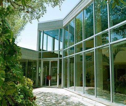
There is lots of talk and awareness of “Modern Design” today, so I thought it might be interesting to explore the history of how this design style evolved. Florida is a place known for its Modern Design heritage, and in fact, has numerous wonderful examples of this design dialect. Let’s look at a bit of history first. Design is all around us, whether we are aware of it or not. Any time a human being has applied paint to a pot, adorned a garment, or manipulated a surface to make something utilitarian more pleasing, design has happened. As societies and civilizations have developed and changed, the definition of what is beautiful changes too. The rich and ornate baroque of the 16th century led to the lighter, more refined and neo-classically influenced style of the 17th century. What once was thickly carved and often gilded became a softer, painted surface, with less elaborately carved details, still highlighted in gold leaf perhaps, but not so extravagantly. In the last part of the 19th century, the heavy and pervasive ornamentation of the Victorian era led to a reactionary series of design movements that stripped away the layers of color, pattern and texture of that time and asked the world to look at things with new, more informed eyes. The Arts and Crafts movement, which had a strong beginning in England during that time, fostered sympathetic colonies of artists, craftsmen, architects and designers in America and Europe. As a reaction to the mass-produced products of the Victorian age, these groups encouraged the hand-wrought object and venerated the individual artist, who often found inspiration in motifs of the natural world. But things took a major shift at a remarkable school in Weimar, Germany. Called the Bauhaus, it was a place where all the old means of learning were thrown out and the students were taught to look at the world from the most basic elements of color, shape and form, as well as the nature of materials - wood vs. steel vs. glass, etc. In addition, they studied the function of an object or building, before applying any form or style to it. It was a remarkable time and place, with the most energetic and passionate individuals coming together. Within those plain walls a rich design stew was concocted. For instance, furniture was formed out of bent chromed steel tubes with wicker seats. These chairs are still in the designer’s lexicon and are still looking crisp and new. Pottery and china, silver serving pieces, woven and printed fabrics, typography and ultimately architecture too were the curricula of this remarkable place. Artists that taught in the school are names that are familiar: Klee, Albers and Kandinsky. Architects Gropius and van der Rohe headed the school at different times. Many of the faculty ultimately came to this country as Europe and Germany became less hospitable to artists and other free-thinkers. They settled in design and architecture schools, and had a profound influence on the development of cities, buildings, and interiors and what we have come to call Modern Design. One of the things that Modern Design has done is open up the box that is the room, both literally and figuratively. A great example of this is the use of glass. Glass is now able to be made in large sheets, and in contemporary homes and buildings sometimes the entire wall surface is glass. Other materials such as steel and concrete are used in similarly innovative ways. When we think of Modern Design we think of bright, open spaces, often lightly colored, and embellished with furnishings that are simple but bold of line, and art that is colorful and strong. In Modern Design, fewer pieces are used but each piece has its own interesting character and uniqueness. Sometimes, whole rooms are created with all new and custom furnishings, with each piece being designed for that particular client or project. These rooms, as period rooms from other ages, have a consistency and cohesiveness that is special and powerful. One can think of great rooms in museums or mansions, where all the furnishings are from the same period, and they have a powerful richness and satisfaction. New rooms can have this same strength where all the furniture, rugs, lighting and art are created and assembled to make an environment that is greater than the sum of its parts. If you are ever in Chicago, try having lunch in the restaurant in the modern art wing of The Art Institute and you will see how fabulous a tightly designed room can be. This recent addition is by the internationally acclaimed Renzo Piano and the restaurant is named for him. The room is one of those places where every surface and fixture is just right. All glass and white with a pale wide plank oak floor, the expansive space is subdivided by graceful banquettes, the tables are topped with pale white resin slabs, the china and silver are all simple, unique and contribute to the experience. The ceiling is simple and plain, and provides lighting, ventilation, sprinklers, speakers and security, and yet is detailed in such a masterful fashion that one is unaware of all those necessities unless you look for them. These sorts of experiences inspire designers to continue improving and refining what we do as well. Other times and situations will require a blend of old and new. At Hughes Design, we sometimes create big spare rooms, where there is nothing more ravishing than a fabulous antique console or commode against a stark and daring wall. We love to blend the old and new. One rule we have, however, is that quality always blends with quality. So you want to buy the best that you can, even if that means buying fewer pieces. So, feel comfortable creating those clean-lined, spare and dramatic rooms that Modern Design has inspired whether with furnishings all from that period or with a well-vetted mix from other times as well. Somehow, good design always goes beautifully with good design.
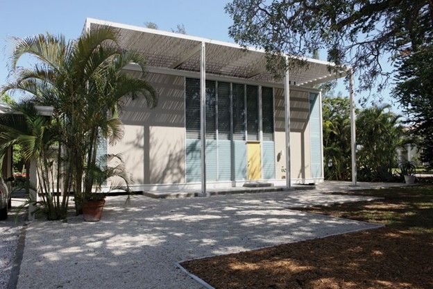
Recently we were talking about Modern Design, and we thought it would be good to continue the conversation more specifically focused on Sarasota itself and the “Sarasota School”. It is interesting to recall that this “modernism” is now more than 50 years old! While that is certainly true, it is also true that as one drives around Sarasota and occasionally sees the houses and buildings from that time, they retain a freshness and originality that is still stunning and inspiring. These people were looking for a place that would provide shelter and comfort, but also embodying a spirit of the times. The world was seeing an emergence from the Depression and a new optimism was growing. They wanted a fresh vision, something new and original. And there was a small group of talented, energetic and artistic thinkers who had also found Sarasota and were welcoming them with their new ideas. Among these, (we will focus this mostly on Paul Rudolf and his group) was a young architect who was starting his career. He was bright and creative, but young and inexperienced. He found employment with another architect and builder, Ralph Twitchell. Twitchell provided the young designer the guidance, experience and mentoring that served him well for many years. Rudolf became the creative force in the office, while Twitchell had the marketing, construction and office administration facilities already in place. In the later 30’s and early 40’s these two started to put Sarasota on the national map of places of architectural interest. Their houses and buildings became published in the national press. One of their notable contributions was a spirit of experimentation and innovation. Some of the houses are still standing and provide a great lesson in accomplishment of spacial modulation, respect of sunlight - both access to daylight and acknowledgement of the harshness of the midday sun and heat, and the use of natural ventilation. These were the days after all, before residential air conditioning. One of our favorite houses, as an example, is the Umbrella House. While the name still sticks, the “umbrella” sadly is no longer in place. Located on Lido Key, it is really a modest house, of simple means, but great result. The exterior is paneled in vertical slats of cypress with outlines of white-painted wood trim. The street facade is a two-story exercise in restraint. It is solid on the left and right sides, with tall windows on each end, and a series of elegantly tall glass panels in the center, punctuated by the entry door. Once you enter you are awed by the large central volume of space which wraps around you. The stair to the upper level and balcony overhead is immediately on your left, but your view is compelled forward through the house and out to the terrace, pool and pavillion beyond. The far wall of the central living space is all vertical glass panels and a series of glass doors opening out. What is really clever and the main concept of the house is a free-standing “roof” structure that stands over the house and provides a visual and conceptual framework under which the house sits - the “umbrella”. Upon this framework a series of rafters and horizontal boards used to provide dappled shade and a marvelous sense of enclosure and protection. The original wood has since been lost to age and moisture, but one’s imagination can re-construct the framework and give one the feeling of what was a dramatic gesture and surely welcome relief from the harsher aspects of the elements, shading the terrace and especially the roof of the house, dramatically reducing the heat onto the structure. The rest of the interior of the house is modest by today’s standards, but provided a serviceable and comfortable habitation. A master suite was at one end on the first floor, with the kitchen/dining area at the other. Upstairs are two matching bedrooms and baths, with some ingenious detailing, such as the cantilevered dressers with extend into the upper levels of the living room. The developments that Rudolf embodied, continued as the 50’s progressed; they could be summarized by an enthusiasm for trying new things. The Second World War had brought new materials and technologies and Rudolf and others were anxious to try their hand at creating new forms and methods. Their goals were to capture the light, make open and airy living spaces, having flowing access to the outdoors, using new materials - plywood and plastics, using tried and true materials in new ways - concrete and the handsome local lime block. Of course, Paul Rudolf was led to other commissions as his career and talent became well known. Many residential projects were built here, and quite a few remain. He designed two high schools in the area, one of which we have now sadly lost. And he has a few commercial projects still standing as well. During this time he also received commissions for the US embassy in Amman, Jordan as well as speaking engagements in South America for the State Department. His career soon propelled him to head the department of architecture at Yale University, not only teaching and heading the school, but also designing its landmark brutalist building that was an icon for its era, matriculating if you will, not only from Sarasota, but from the style and milieu that he was seminal in helping create. While the Sarasota School is now considered a point of time, now long ago, the legacy is a living one. We can admire the remaining examples of that original core group, and also honor the continuum of modern design by architects and designers now practicing in Sarasota. There are certainly some notable and remarkable talents still at work in our (now not so little) town. One doesn’t need to travel far to see some interesting and “edgy” designs that still proclaim a unique and personal vision of contemporary design. Stark, planar, angular, strong, colorful and daring are words that evoke some of these more successful projects that are found in our landscape and enrich our community. Variety is the spice of life, and our stew is nicely seasoned here in Sarasota with designs modern in the past and contemporary in the present.
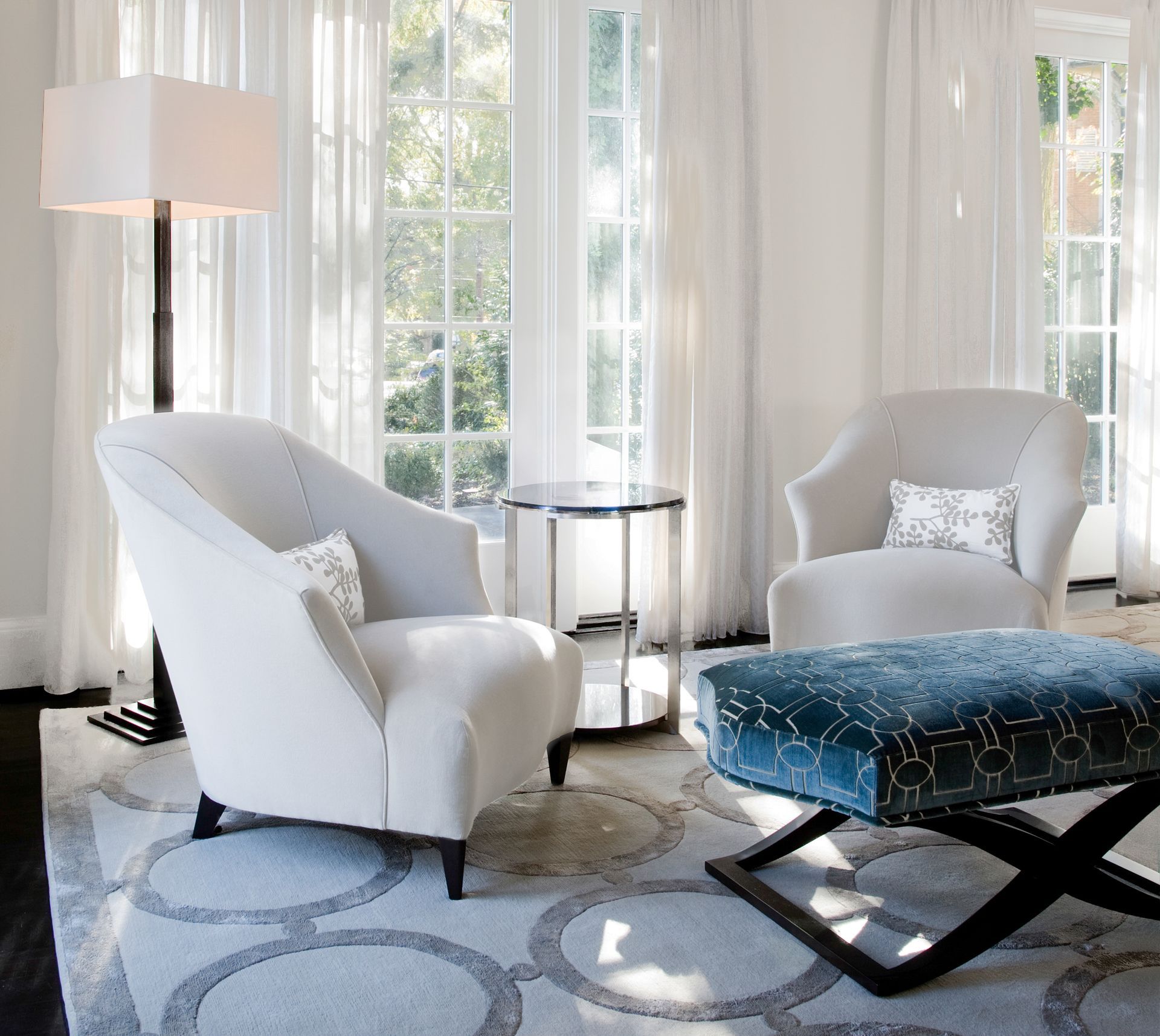
One of the things so many of us love most about Sarasota is that it is casual, but also elegant. We dress casually but elegantly, achieving this look with sometimes just one small detail: a stunning necklace with white jeans, or perhaps a silk handkerchief in a sportcoat pocket worn with blue jeans. We have so many elegant places to go: fabulous restaurants, The Van Wezel, The Asolo, festive social events and a myriad of other cultural and social venues. Being casual but elegant is a great way to be comfortable but still look and feel appropriately and beautifully dressed. The same concept applies to interior design. In Sarasota, particularly, we love the outdoors: the water, the sun, the beach and our gardens. A successful interior here is one that celebrates all of these glorious exterior elements in a casual but elegant manner. Sarasota designs are looser and lighter than up north. We use less furniture and lighter fabrics. The floor plans tend to be more open, rooms flow from one to another, and especially to the outdoors. Elegance remains, but there is a transparency to the open air. Light is allowed to be a part of the overall design, and windows are either left uncovered or softly draped, sometimes hiding a required solar shade for functionality. Mirrors are effective in that they reflect the outdoor spaces, increasing that sense of oneness with the natural world. Another design element that is used frequently in Sarasota and similar climates is the outdoor “living room” or loggia. These rooms are furnished as comfortably and as beautifully as any interior room, and often can be closed off from the elements or when the owners are out of town. Outside rooms are the utmost in luxury--gorgeous furnishings to be enjoyed in gorgeous weather. You can create these outdoor living spaces on balconies with oversize and comfortable chaise lounges, and on terraces with smaller seating and tables. In fact, there are so many new and stylish outdoor furniture designs available today that these outdoor spaces truly can look and feel as luxurious as any interior space. The casual look is also achieved with not only less furniture, but lighter colored furniture, often with a painted finish. Use darker pieces for accents to keep the room light and airy. Go easy on the accessories. Let the furniture and art carry the room. A few large pieces are much more dramatic and effective then a collection of small items. And easier to take care of also! Remember, less is usually more, and this holds true when creating a casual yet elegant interior. We previously wrote of our exquisite Sarasota waters, skies and sunsets. We spoke of capturing the sparkling azure blue, clear aquamarine and effervescent sea greens so often seen in our celebrated environment. Color is so important that it is worth mentioning these tones again. Pair them with some soft neutrals and sand tones and you have an easy, but striking color palette. And speaking of water, tie that wonderful element into your design scheme by using fountains, pools and ponds, large or small, to create that other sense of casual elegance. Gardens are often an integral part of a Sarasota home. Lush foliage adds freshness and can create an extension of the house that is used all year long. Courtyards and intimate garden areas allow us to enjoy the outdoors in an elegant way. Because of this relationship, patterns and textures from nature, captured in fabrics, add to this special casual, yet elegant feeling. Casual but elegant natural materials, which also bring the outdoors in, are special wood species for ceilings such as clear cypress, pecky cypress, and douglas fir. Flooring can be rustic but elegant using any number of porcelain tiles or terra cotta. Mix all of these elements together, remember that what is most beautiful is our natural environment, and you have a casual but elegant Sarasota style home.
One of the things we like to do in our work is to celebrate the place we’re in. If we’re in the mountains, be rustic and bold; if we’re in the city, be sophisticated and urbane; and if we’re at the beach, then be casual and light. My first project in the Sarasota area was working on The Ritz-Carlton. We had done other projects for The Ritz in locations across the country, but when I first came here to look at the area and start working I knew this was someplace special. And by the time we were done with the project, I was looking for a home to call my own here. Somehow, you just know when a place is right. It feels like home. For me it was the warmth, the light, the colors of the sea and sky, the drama of the sunsets. So working here, I like to use and emphasize those colors that are this place. I like my palette here to be full of lightness. The walls are a creamy pale sand, just like the beach. The fabrics are light and airy, with lots of natural fibers and colors, and accents of blues and aquamarines. Interest can be found in the counterpoints of dark or painted furniture and bold lamps and, of course, art. In other articles, we’ll talk about these things in greater detail, and give examples and solve problems that are common to Sarasota and part of what gives it its charm. We’ll go shopping in the area and look for art. We’ll look at projects and answer questions that both newcomers and those who have been here for quite a while are looking to solve. We’ll talk about lighting and furnishings, keeping rooms open and spare, planning room layouts, “aging in place”, palettes derived from the area, materials, fabrics and the gamut of elements that make up design. But through it all, will be the things that are unique to western Florida and especially our beloved Sarasota. For now, though, we’ll talk in generalities. Some of the things that we did at The Ritz, that first project of ours here, can be used in individual residences as well. We kept the palette light. The floors are a rich, but pale polished marble – overlaid here and there with thick, richly patterned rugs. The floors were polished for the hotel and suitable for it, but for a residence, we often prefer honed or “tumbled” stones, which give a more casual, softer finish and appeal. We kept the furnishings spare. That is one of the lessons of working here: fewer large pieces in the rooms make the rooms more airy and light. It is refreshing to be in places were there is room to move, and space and light are as much a part of the furnishings as a sofa. It is always better to have a few really good things as many things of lesser quality. A few fine antiques show off so well against an open room, where the details and patina of a piece can stand out. We like to mix antiques and contemporary furnishings. Good design knows no borders or time periods. We can love a fine old armoire or desk as much as a spare elegant sideboard from today. And they usually go well together! Another thing that we love to do is keeping things casual – we are at the beach after all. But keeping things casual does not mean sloppy or inelegant. Our rooms are often treated with crown mouldings (of the proper scale), and perhaps added wainscoting for the more important rooms such as the living room, dining room and entry areas. Then the materials are kept light, the spaces open and the colors fresh and pale. The lines of furniture are not heavy or fussy. Even chairs are often open-armed and not fully upholstered. All in an effort to create that open, easy mood. So come back from the beach club or the golf course, kayaking among the mangroves, or shopping on St. Armands and nestle in to your light and casual, fresh and breezy Sarasota home. And if it’s not all that already, then keep an eye out for our additional tips on making your home that and more.
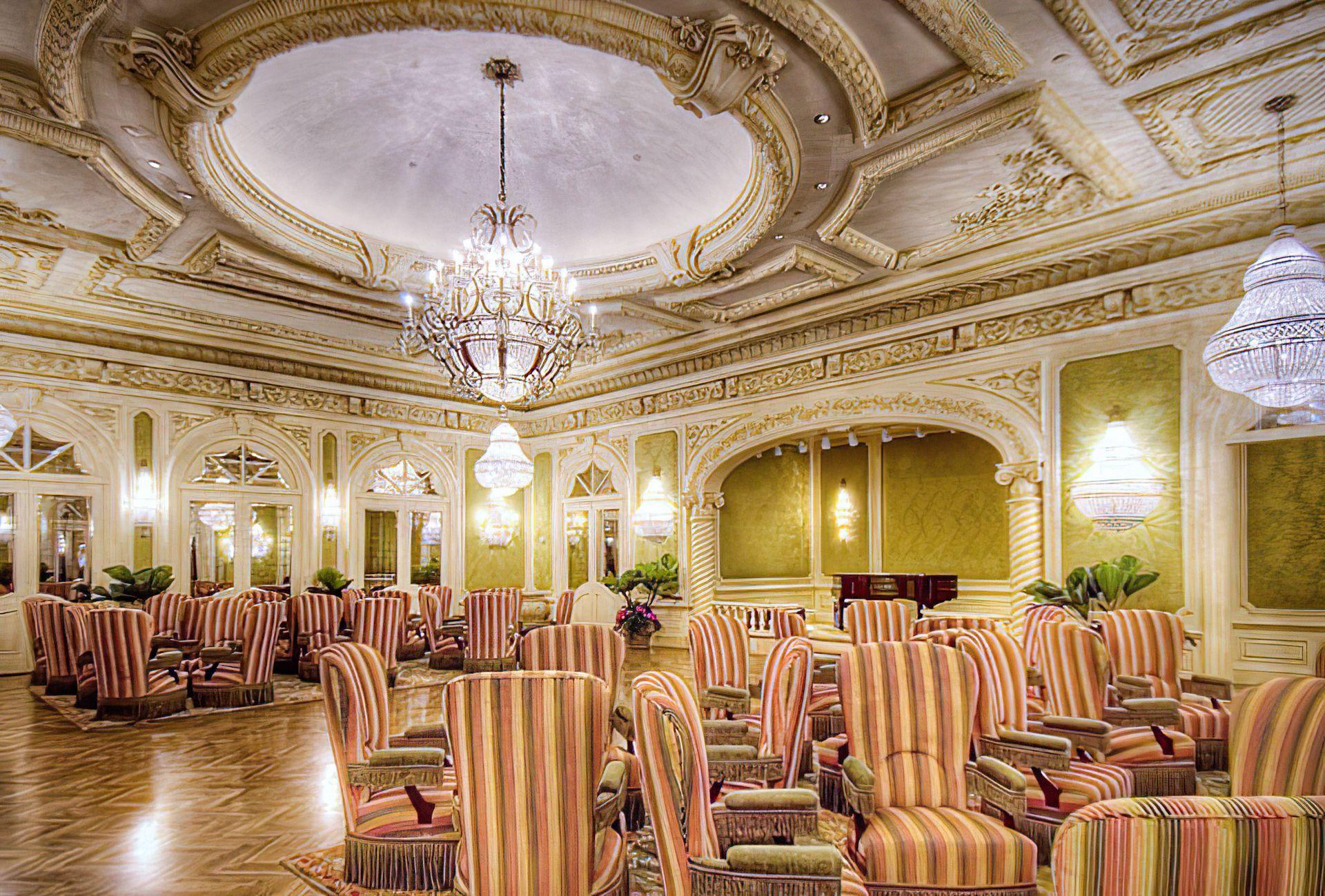
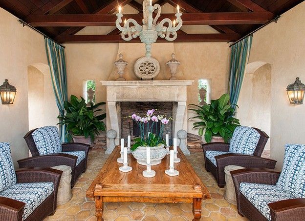
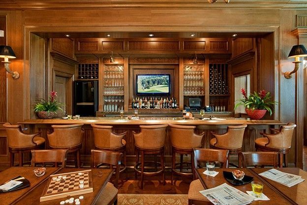
Capturing the essence of Palladian architecture, The Concession Golf Clubhouse has now opened its doors and is graciously welcoming residents and enthusiastic golfers. Refreshingly elegant, The Clubhouse was expertly designed to introduce a new golf clubhouse concept utilizing an innovative color palette, sophisticated finishes and a brilliant use of space allowing for breathtaking golf course views from every interior room. Working closely with the developer, Kevin Daves, the building was designed to be a contemporary interpretation of the work of Andrea Palladio, the 15th C. architect, featuring dramatic symmetry and the vocabulary of classic Italian architecture. Sweeping loggias on the front and rear of the building provide welcomed shade from the sun, while maximizing outdoor living space for year round enjoyment of this serene location. International fashion designer Adrienne Vittadini and Hughes Design Associates worked together to create a stimulating interior, breaking the traditional themes usually applied to grand scale country clubs. The designers are responsible for all of the interior design of The Clubhouse, as well as all of the furnishings and finishes. Entering The Clubhouse, the welcoming foyer features a vaulted ceiling and gracefully faux-finished walls, complementing the elegant stone floors with subtle contrasting inlays. This dramatic reception area, with a subtle reference to the soft elegance of Tuscany, provides access to the main living room as well as to the golf corridor. The social areas of The Clubhouse include the main living room, dining room, bar and numerous verandas. The inviting living room features a spacious two-story ceiling with decorative beam detailing. Painted panel moldings enhance the walls and create a graceful contrast to the suave contemporary furnishings, achieving a comfortable yet sophisticated balance. A magnificent antique Baccarat crystal chandelier, a large stone mantel, wide plank hardwood flooring and a custom area rug provide the framework for the living room. Elegant draperies in pale aqua tones, luxurious upholstery fabrics, fine lamps and accessories, a pair of majestic mirrors, and bold, contemporary paintings provide the finishing touches. The nearby dining room shares the same elegance, with a coffered ceiling, a pale stone mantel hand-carved in England and custom patterned Axminster carpeting. Grand crystal chandeliers illuminate the room, setting off the painted pilasters, wainscoting, artwork, fine consoles and comfortable dining chairs. A similarly elegant private dining room is also available for exclusive parties and events, while outdoor dining is accessible on the adjacent verandas. The handsome bar was designed for casual socializing, utilizing burled walnut paneling, warm-toned supple leather seating and exotic granites to create an intimate gathering space. Setting the inspiration for the golf course and clubhouse, the 1969 Ryder Cup portrait of Jack Nicklaus and Tony Jacklin is featured in the golf corridor. This grand passageway provides access to the locker room areas, Pro Shop, support spaces and administrative offices. Expansive windows allow abundant natural light to illuminate the trophy cases, golf photos and original Jack Nicklaus hand renderings of The Concession Golf Course. Emphasis on the pastoral views of the surrounding impeccably manicured golf course is taken into consideration by the utilization of french doors and large windows within each interior space. Every set of french doors opens to a covered terrace and is framed by simple, yet luxurious drapery panels. The Concession Golf Clubhouse features richly finished locker rooms for both men and women. The women’s locker room has an elegant Swedish theme with clear pale blue and white tones flowing through the lofty open space. The walls are graced with original pastel drawings, while the wood floor features a custom wool area rug woven in Thailand. The spacious area includes locker and dressing areas, a sitting room, and an elegant bath area finished in Calacatta marble. Dressing and make-up areas are en suite and designed in anticipation of many bridal and evening functions. In contrast, the men’s locker rooms are a rich environment steeped in the “men’s club” traditional ambience. The main locker room’s expansive gabled ceiling is faced with clear pine tongue and groove paneling and accented by cypress wood beams and massive arched trusses, illuminated by handsome custom pendant light fixtures. Mahogany lockers line the walls and a custom carpet woven in England covers the floor. The space also includes a separate lounge area with full bar, English leather upholstered seating, an abundant amount of television panels for viewing from every location, and multiple card tables. Rainforest green granite on the bar complements the rich wood tones of the walls and ceiling. The custom patterned large-scale area rugs, woven in Turkey, result in a handsome and distinctive gentleman’s lounge environment. Inviting verandas flow along the rear of the building anchored by cast stone flooring and capped by stained tongue and groove wood ceilings. Just beyond, a large open terrace provides casual golf dining with a fire pit and multiple seating options. An enchanting gazebo is strategically placed nearby for special events. Even the restrooms are finished in a variety of light and exotic stones and tiles, highlighted with painted or rich wood trim and fine light fixtures and fittings. Attention was paid to every detail and comfort. Utilized throughout the 33,000 square feet facility are custom light fixtures from Paul Ferrante, an exceptional custom lighting manufacturer. Adrienne, Kevin and I visited the California factory, working with the artisans to custom design each light fixture in order to achieve the correct proportion, scale and custom finish for each piece. Artwork, mirrors and furniture were also custom designed to fit each location. The designers directed skilled craftsman to create one-of-a-kind pieces throughout The Clubhouse. Rugs were commissioned from looms all over the globe including Turkey, India and Pakistan. Intriguing artwork was found in Sarasota, as well as throughout the United States. Commissioned artwork was executed by David Steiner, Alison Hill, James Kandt and Ted Tihansky. Capturing the great tradition and the true spirit of the game, The Concession Golf Clubhouse was constructed to exceed expectations and to break new ground. The thoughtful and intentional design of each space is a pure example of staying true to the rich heritage of golf, while at the same time embracing a modern approach to interior design and finish. The Concession Golf Clubhouse is an exceptional collaboration of elegant architectural design, sophisticated furnishings and rich finishes showcasing an innovative design concept.
Previously, we wrote about the “Sarasota School” - that famous collection of architects and architecture that developed along our shores some 50 years ago. That article stimulated much interest so we thought it worthwhile to explore it more. I had the wonderful opportunity of meeting one of the seminal members of that elite group earlier this month and was honored to learn more from him. Carl Abbott, FAIA, is not only a well-known practitioner of architecture, with a string of awards that encompasses his long and continuing career, but a man who was generous with his time and congenial in spirit. He was kind enough to welcome us for a lovely afternoon in his office showing us some of his projects and talking about the personalities and history of that time. I would love to share with you some of the reminiscences and ideas from our meeting. One of the things that he touched on was the background of The Sarasota School. In the first half of the 20th century, architecture seemed to be evolving in two different directions: Frank Lloyd Wright coming from a world influenced and inspired by Nature, developing an “organic” architecture; and the International Style, originating in Europe, particularly at the Bauhaus, in Weimar, Germany, which acknowledged the effect of the machine in the built environment. The Sarasota School seems to embrace elements of both of these philosophies, so here’s a bit of its family tree. From Nature’s Realm: Frank Lloyd Wright, from Chicago, was the nearest architectural ancestor. He not only embodied the philosophy of organic architecture, but also had a considerable body of work in Florida, including residential projects as well as the magnificent campus of Florida Southern College in nearby Lakeland. He had close ties to the offices of Louis Sullivan, whose works are embellished with fanciful designs derived from natural forms. Sullivan, in turn, was related to the bold, strong work of H. H. Richardson. And they were both influenced by the Arts and Crafts Movement, originating in Scotland and England, which revered the handmade and was inspired by the natural world. Honoring the Machine: A movement which honored the machine-made also grew out of Europe. This aesthetic was distilled in the design school known as the Bauhaus, or International Style. That style is characterized by a more scientific and rational approach to design and the elimination of ornamentation - and the philosophy that “form follows function”. The school was founded by Walter Gropius and then guided by Mies van der Rohe. These two later came to America - Gropius to head the architecture department at Harvard and Mies to become one of the iconic architects of post-war industrialized urbanity. His Seagram Building in New York became the epitome of the style. And Gropius’ influence is still felt, from his legacy at Harvard and, related to our discussion, in one of his pupils, Paul Rudolph. Rudolph became the progeny of these two apparently disparate philosophies. He moved to Sarasota from Harvard and started working at the welcoming and accepting office of Ralph Twitchell. Ralph was already an established architect in Sarasota and one known to encourage a daring and experimental approach. He arrived in Sarasota to assist the architect of Ca d’Zan, then under construction. What he soon came to learn was that old methods of construction that might work in northern climates, do not fare well in our intense southern climate with sun and humidity as predominant factors. Ralph had already started to develop methods of construction that became common all over Florida. He was developing poured concrete slabs for floors and the use of exposed concrete block for walls. Even by the late 1930’s, he was using a poured concrete roof slab for some houses. In the early 1940’s, Twitchell’s office welcomed Paul Rudolph and the two embarked on a series of small houses and projects that helped put Sarasota on the map architecturally. Within several months, the office produced designs for Twitchell’s own residence and three other houses. These houses mark a new direction for the office, which shows the influence not only of Rudolph, but also of ideas that can be traced to Wright. Elements such as horizontal strip windows and differentiated ceiling heights to separate service and living spaces are among these new ideas. After the war, when the office was reassembled, exciting new materials and technologies were tried. Rudolph’s famous Cocoon House, sitting lightly above the land and cantilevered over the water on one side with its daring curved plywood roof plane, made it a small house with a powerful impact. One of our favorites (and Rudolph’s too) is the Walker Guesthouse on Sanibel Island. It is a charming and clever project that encloses a modest living space, but expands it remarkably by the use of a framework that extends beyond the walls. This frame supports a series of shutters that hang against and protect the glass or screen walls when closed and becomes sunshades when lifted to open. Other projects are similar in their approach and are unique and experimental. His reputation and talent inevitably pulled him from Sarasota to New York, Yale and beyond, but his influence, and the work and presence of many others, made for a special community of designers still at work today which is international in scope. Coming to Sarasota after his education at Yale (while Rudolph was Dean of the school), Carl Abbott became a member of this exceptional group. He joined our architectural community and has added richly to the local collection of unique and daring buildings. His career has produced a remarkable portfolio of bold and exciting residential projects as well as public and institutional buildings ranging from libraries, churches and special needs centers. Many thanks to Carl Abbott, FAIA for sharing his time, his stories and his work. We are all the beneficiaries and students of the Sarasota School. I encourage you to investigate his website to see images of his work: www.carlabbott.com
Whether we like it or not, televisions are here to stay. They are in our lives, for some of us, from the moment we wake up to the last thing we hear or see at night. And all through the day, it seems there is hardly a place where there isn’t a screen flickering with some urgent image. Whether it’s your lifeline to the world and staying in touch, or following your favorite program, they are everywhere. We, of course, as designers try to find ways to make televisions accessible, when and where our clients want them, and also to make them discrete or disappear when they don’t. Fortunately, we are now at the stage of the media evolution that seemed like dreamy science fiction when we were younger. Namely, flat panels that hang on the wall. It all seems especially appealing when it was only a decade or so ago that we were dealing with building large armoires to hold large-screen TV’s that were practically as deep as they were wide - and they weighed a ton. We still use these pieces of furniture on occasion as a focal point and to have something beautiful in which to conceal a large screen TV. In some of those cases, we have a false back built so that the TV has a surface from which to hang. This also allows a space for cables and wires to occur without being seen. Often, these days, we hang a TV on a wall surface (adequately supported, of course). Prior to installing the TV, the wall must be prepared with adequate plywood or other structural support provided behind the finished surface, and the power supply and cable and other signal wires need to be in their proper place too. So coordination time with the contractor is required. But it can be a relatively simple and effective solution. That method works particularly well with contemporary interiors. No muss, no fuss, just the image floating on the wall. But, like art, we usually like to ground the image on the wall with an object below. When we are dealing with a television, the furniture below provides a place for the often required machinery. DVD’s and cable boxes are still a part of most of our worlds. Some of our clients are now having whole-house electronic systems which can provide various channels in different rooms, whole house audio in public spaces (indoors and out) and a host of other functions. This generally means that there is a centralized room which contains the racks of equipment and which is appropriately air conditioned to help remove all the heat generated. These systems are remarkable and can be designed so they are easy to use. You can be in the room with a remote control, point it at the TV, and a menu is displayed giving you options for what is available to view and movies you can call up or download. In some cases, when we have a more traditional interior, we like to make the TV less prominent, so we have a recess built into the wall or above a fireplace mantel. Of course, the same requirements apply of providing adequate support and the wiring connections. In this case, however, the 6” - 8” recess allows the TV and its supporting bracket to create a condition where the surface of the screen is essentially on the same plane as the wall. We can then leave it in a simple rectangular opening or install a beautifully finished picture frame to hug the TV. This can sometimes actually cover up most of the integral TV frame. But you have to be careful when doing this as sometimes the speakers and the infrared signal receiver for the screen is built into its frame. Accommodation to the picture frame must be made to allow those to still work. Large screens seem to be getting larger too. Some of them are so big they do not easily fit into the proportions of the room. So we create rooms especially for them. They are called home theaters and we’ll do another article on them soon. The reverse is true too. TV’s are also getting smaller. They are able to be hung below cabinets tucked in the corner of a kitchen so that the news and shows can join the activity of kitchens and families. We put them behind special mirrors so the news is available while you are in your bathroom getting ready for the day. They are also, of course, now portable, and with your iPad you can stay current on your shows, the news and whatever else is on the air almost anytime, anywhere. Science fiction, indeed!
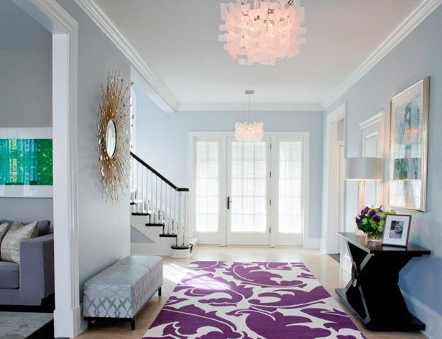
Often people ask us, “Just how do we start a design? What are the first things we do?” Well, there is a lot that we do prior to starting, such as research, lots of listening, etc., but when we actually start to design, we often start with the rugs. Usually a color palette is “built up” from the selection of rugs. As we designers like to say, “It is easier to find a fabric to go with a rug, than a rug to go with a fabric.” So often we start by defining the color palette with the rugs. Rugs can be many styles and colors. In today’s contemporary styling that is so popular now, there are many resources that are producing gorgeous modern-styled rugs in fabulous abstract designs. These designs are often done with muted, soft colors or, depending on your design intent, can be brightly colored. They can be custom designed and colored, and made to the exact size your room requires. Usually they are made of wool (wool simply absorbs color better than other materials, not to mention being phenomenally durable and stain-resistant), and can be ordered to a thickness or specific “yarn count.” These contemporary rugs can look as beautiful on a floor as an abstract painting looks on the wall, and are often used as a floor covering without much furniture on them. They definitely “anchor” the design of a room and can be a major focal point. Alternately, there are incredible antique rugs available in traditional designs, or new rugs that look antique. One of our favorite sources for new rugs is a company that produces rugs the exact way they were made over 200 years ago. They weave rugs in the same villages in Turkey where they have been weaving them for centuries, while using the same pure vegetable dyes and wool from sheep that have grazed naturally on the same hillsides. In fact, the people making the rugs are descendents of those who perfected the craft so long ago. They have the same method of “finishing” the rugs, creating glossy or matte yarns, muted or bright colors, for an old look or newer look. They can make the rugs look more antique by dulling the colors, and cutting the nap of the rugs to create worn-like areas. The patterns are traditional (though they are starting a new line with more contemporary, simple designs) and the colors original to the design. It is fascinating to see these rugs made on the old looms in charming, quaint villages. The product is superb; often dealers have to inspect the rugs very carefully to determine if they are new or antique. We have used their rugs in grand hotels and private residences with remarkable success, and love the richness and sense of quality that they immediately bring to every room. Antique rugs can also be used in the same ways, but one is more dependent upon the existing rug in color and pattern when beginning a room design. Whether you buy a “new” antique or have one that’s been in the family for generations, we love the gently worn patina and slight wearing that old rugs give. It speaks of quality and stability, at the very base of the home. And antiques are often so dappled with a myriad of colors it is usually easy to find something in them to go with a color scheme that is being developed. So now that we have choices as to design, how do we use rugs to maximize their impact on the interior you are creating? Many ways, and there are a few rules. First of all, rugs can be a terrific foundation for a seating arrangement. The rules are to generally keep the furniture on the rugs, avoiding the “one leg on, and one leg off” situation. When designing new rugs or shopping for them, we generally size the rugs prior to buying. It is best to not have the rug too big for the room - we always like to see some of the wood or stone floors at the edges of the room. It frames the rug and allows the floors below to show some of their glory. But we also see rugs too small for a room. A little oriental parked under a coffee table would really be much better suited to an entryway, foyer or small room. And always try to bring some of the colors of the rug up off the floor - use the russets or blues in upholstery fabrics or accent pillows. Similarly, art can have a sympathetic and amplifying affect of having the same hues as in the rug, which works to the benefit of both. So with that, unroll that ancient rug in the attic, head out to an auction, or go find a lovely new rug and shake up one of your rooms. It will give you lasting pleasure and interest.