Modern Design

There is lots of talk and awareness of “Modern Design” today, so I thought it might be interesting to explore the history of how this design style evolved. Florida is a place known for its Modern Design heritage, and in fact, has numerous wonderful examples of this design dialect. Let’s look at a bit of history first.


Design is all around us, whether we are aware of it or not. Any time a human being has applied paint to a pot, adorned a garment, or manipulated a surface to make something utilitarian more pleasing, design has happened. 


As societies and civilizations have developed and changed, the definition of what is beautiful changes too. The rich and ornate baroque of the 16th century led to the lighter, more refined and neo-classically influenced style of the 17th century. What once was thickly carved and often gilded became a softer, painted surface, with less elaborately carved details, still highlighted in gold leaf perhaps, but not so extravagantly. 


In the last part of the 19th century, the heavy and pervasive ornamentation of the Victorian era led to a reactionary series of design movements that stripped away the layers of color, pattern and texture of that time and asked the world to look at things with new, more informed eyes.


The Arts and Crafts movement, which had a strong beginning in England during that time, fostered sympathetic colonies of artists, craftsmen, architects and designers in America and Europe. As a reaction to the mass-produced products of the Victorian age, these groups encouraged the hand-wrought object and venerated the individual artist, who often found inspiration in motifs of the natural world. 


But things took a major shift at a remarkable school in Weimar, Germany. Called the Bauhaus, it was a place where all the old means of learning were thrown out and the students were taught to look at the world from the most basic elements of color, shape and form, as well as the nature of materials - wood vs. steel vs. glass, etc. In addition, they studied the function of an object or building, before applying any form or style to it. It was a remarkable time and place, with the most energetic and passionate individuals coming together.


Within those plain walls a rich design stew was concocted. For instance, furniture was formed out of bent chromed steel tubes with wicker seats. These chairs are still in the designer’s lexicon and are still looking crisp and new. Pottery and china, silver serving pieces, woven and printed fabrics, typography and ultimately architecture too were the curricula of this remarkable place.


Artists that taught in the school are names that are familiar: Klee, Albers and Kandinsky. Architects Gropius and van der Rohe headed the school at different times.


Many of the faculty ultimately came to this country as Europe and Germany became less hospitable to artists and other free-thinkers. They settled in design and architecture schools, and had a profound influence on the development of cities, buildings, and interiors and what we have come to call Modern Design. 


One of the things that Modern Design has done is open up the box that is the room, both literally and figuratively. A great example of this is the use of glass.  Glass is now able to be made in large sheets, and in contemporary homes and buildings sometimes the entire wall surface is glass. Other materials such as steel and concrete are used in similarly innovative ways.


When we think of Modern Design we think of bright, open spaces, often lightly colored, and embellished with furnishings that are simple but bold of line, and art that is colorful and strong.  In Modern Design, fewer pieces are used but each piece has its own interesting character and uniqueness.


Sometimes, whole rooms are created with all new and custom furnishings, with each piece being designed for that particular client or project. These rooms, as period rooms from other ages, have a consistency and cohesiveness that is special and powerful. One can think of great rooms in museums or mansions, where all the furnishings are from the same period, and they have a powerful richness and satisfaction.  New rooms can have this same strength where all the furniture, rugs, lighting and art are created and assembled to make an environment that is greater than the sum of its parts. 


If you are ever in Chicago, try having lunch in the restaurant in the modern art wing of The Art Institute and you will see how fabulous a tightly designed room can be.  This recent addition is by the internationally acclaimed Renzo Piano and the restaurant is named for him. The room is one of those places where every surface and fixture is just right. All glass and white with a pale wide plank oak floor, the expansive space is subdivided by graceful banquettes, the tables are topped with pale white resin slabs, the china and silver are all simple, unique and contribute to the experience. The ceiling is simple and plain, and provides lighting, ventilation, sprinklers, speakers and security, and yet is detailed in such a masterful fashion that one is unaware of all those necessities unless you look for them. These sorts of experiences inspire designers to continue improving and refining what we do as well.


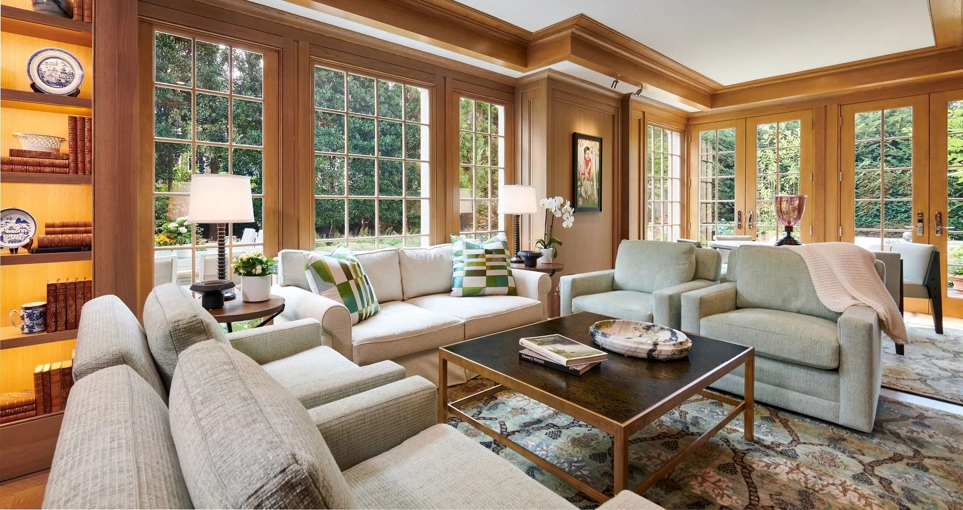
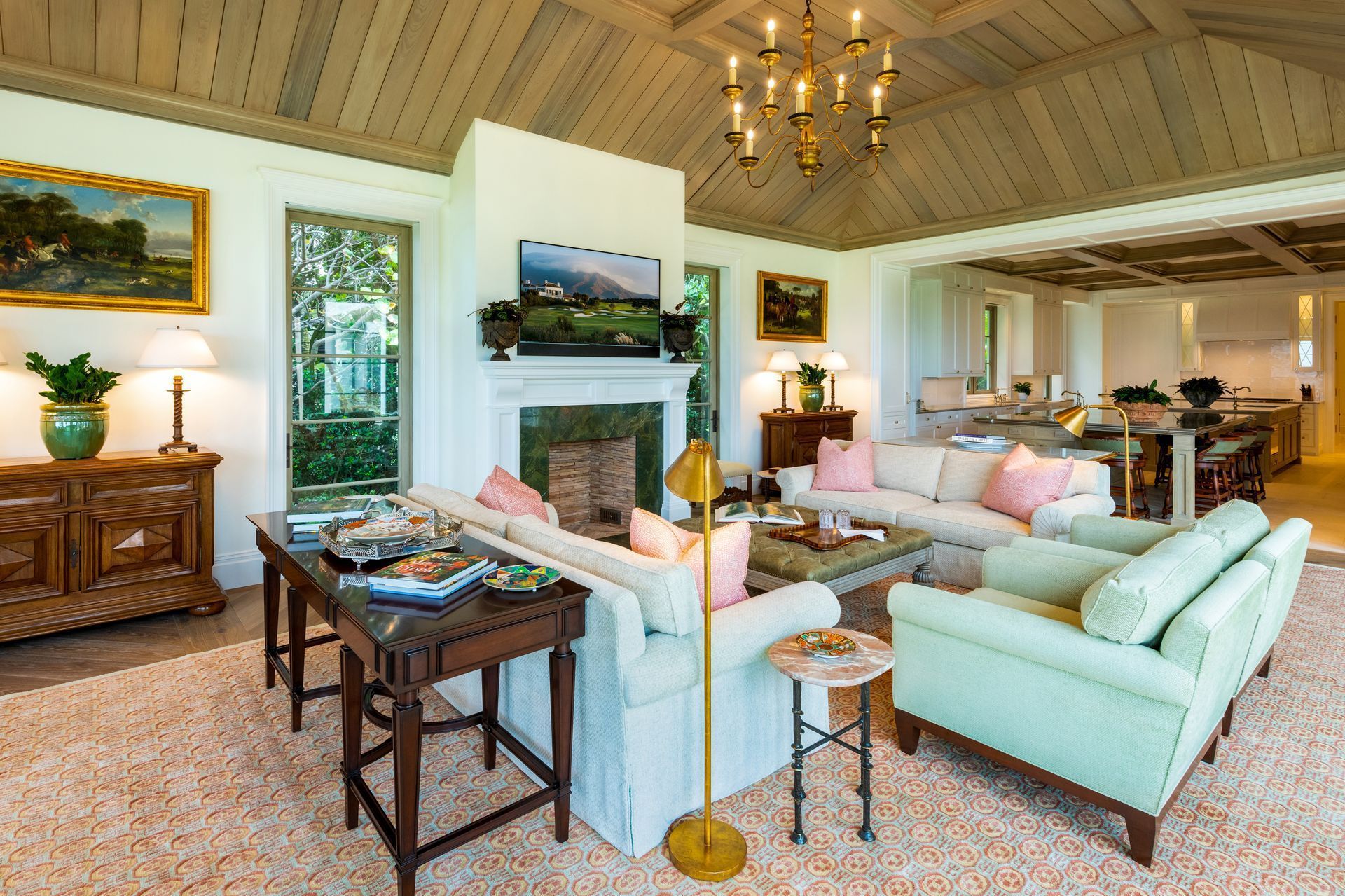
Other times and situations will require a blend of old and new. At Hughes Design, we sometimes create big spare rooms, where there is nothing more ravishing than a fabulous antique console or commode against a stark and daring wall.  We love to blend the old and new.  One rule we have, however, is that quality always blends with quality. So you want to buy the best that you can, even if that means buying fewer pieces. So, feel comfortable creating those clean-lined, spare and dramatic rooms that Modern Design has inspired whether with furnishings all from that period or with a well-vetted mix from other times as well. Somehow, good design always goes beautifully with good design.

October 7, 2025
Our end of the design business is boutique by nature. The word “boutique” means a small specialty shop. And while we design projects from large, grand and elaborate hotels and premier residences, we like to feel that we too are a specialty shop. You get individual, personalized service, and especially custom, unique designs. For this we depend upon not only on our firm’s talented staff, but a host of remarkable resources that we have found over the years. We have developed a great rapport between these owners and artisans and can call on them to produce elements for our projects that can be found nowhere else. We’ll give you glimpse into some of them for you here. A few of them are even local to Sarasota, and others work for us from around the country to across the seas. When we were working on the designs for The Concession, the prestigious new golf resort here, we commissioned a series of custom light fixtures and even casegoods from a great company in Los Angeles. Paul Ferrante has been fabricating specialized lighting, some of it replicating antique fixtures. They have developed over the years a group of talented international artisans from Europe, Mexico and the United States, who have learned or brought with them, skills that are fast disappearing. They can shape metal and glass, they can finish it with a high polish, or a soft and alluring patina. They can carve wood and copy an antique (if we need more than one). And they do it all with great elan and care. They are easy to work with and produce elements that transcend the merely functional into charming and attractive objects. Another great resource we used at The Concession is Woven Legends. This company is a treasure. They are located on the east coast, but their workrooms are half a planet away. They make hand-knotted rugs in a time-tested and traditional manner. What is unique is that we can work with them to make traditional patterns - which we can expand or shrink to suit the size of the rug and color them to suit our palette. After we have done our design work with them, they transmit the specified designs and colors electronically to Turkey where the information is taken by motorbike out into remote villages. Here, local craftswomen sit at ancient looms, just as they have for centuries, and tie knots by the thousands. The result is a series of glorious rugs that will be heirlooms to be treasured by the next generations of Club members. On a smaller scale, we have an artist in steel, Thomas Clarkson, who can make delicate looking flowers out of wrought iron. His anvil is in Atlanta and his work for us includes fireplace screens - either handsomely classical, or with whimsical local references, like shells and sea creatures. They make a wonderful and subtle touch at the hearth. Closer to home, we often call on Bill Hartman of the William Hartman Gallery on Palm Avenue. He provides professional and careful framing for many of the fine art procurements we make for our clients. Working with Bill is easy; he has the resources and a great eye along with the experience, which makes the process a pleasure. He also now has a great trove of vintage photographs of “old Sarasota” that are a great find. So, all this talk of boutiques has put me in a shopping mood, so off to the pleasures of searching for a treasure for a bargain.
October 7, 2025
Previously, I wrote about the art of framing. Now, after spending a few weeks searching the art markets for clients, it seems appropriate to write about the selection and purchasing of art. The phrase, “Beauty is in the eye of the beholder,” is never as true as it is with art. Even educated and totally knowledgeable art critics can have different views on a particular piece of art. Sometimes art is selected because the viewer sees it as pleasant, calming, beautiful, technically well-produced, shocking, avant-garde, valuable, or as a good investment for resale. All of this art can be “good”, if it is simply selected due to personal preference or intent. Generally, the person who is new to art will select a piece that is pleasant or beautiful. They may not know the techniques used or even care; they just like the art for its decorative value. This is wonderful – art should be a part of everyone’s life whether one is an art expert or not. Some collectors like avant-garde art which can often be outrageous, sometimes arousing, or simply something new. Some of this avant-garde art is not understood by either the novice or the professional. But it is a new expression and often offers us a new way of looking at something mundane or “everyday”. New expression is good. Often it leads to greater and more accomplished expression. This point is easy to illustrate especially with the contemporary art of the sixties and seventies. Lots of canvases were painted, some just all white or of another color, and lots of stripes (The Washington Color School) or splatters of paint (a la Jackson Pollock and Clifford Still). It is easy to say, “I could have done that,” and lots of us could have. But, the artists did it first, and by doing it first, got credit for starting the trend, helping us see things in a new way. Then there is intellectual art, which can easily fall into the avant-garde category. Intellectual art is a thoughtful and deep manifestation by the artist which some people can comprehend and others cannot. Often, it is understood by studying or knowing the artist, so one can appreciate the elements of the art and what the artist is trying to convey. In the upper echelons of art, technique becomes more important. Old Masters are celebrated because of breakthroughs in technique or style for their era. For instance, Vermeer used light in a new way, Renoir was a leading painter in the development of the Impressionist style, and Picasso is known for his founding role in the Cubist movement. There is endless advice on why and how to buy art. Some people believe that art gains value when it changes hands, so there is the investment angle. Others say to buy art that challenges you, buy what makes you feel good or buy from artists you admire or know. My advice is: buy the best art you can afford for whatever your strategy or for whatever your reasoning happens to be. Buying art, and having art, enhances your daily life, supports the community of artists and art dealers, and opens up your world. And artists are fun and interesting people! The next time there is an art opening, take advantage of this wonderful social, intellectual, and eye-opening experience. Go and enjoy!  Visit studios, open the lines of communication with artists and dealers, and get involved. It is great fun, stimulating and who knows! Maybe you’ll come home with the next Picasso or Renoir!
October 7, 2025
In an earlier article, we wrote about all things that speak of our beloved Florida: glorious sky and sand, lush flowers and foliage, striking sunsets and sunrises, and most importantly, our beautiful and abundant waters. Almost everywhere that one drives, bikes or walks in this beautiful state, we are blessed with incredible water views. It is an element that makes Florida so special and unique, and which instantly relaxes the visitor as well as the long-time resident. We’ve talked about how, in our work, we like to celebrate the place we’re in. So how does one celebrate our gorgeous Florida water views and vistas? We do it in several ways. First of all, whenever we’re designing on or near the water, our focal point is always the view. Window treatments, if used at all, frame the windows and rarely cover the glass. Furniture is low or pulled back from windows, allowing a closer look. With a beautiful view, one is naturally drawn to it. So, our space planning insures easy access to windows and especially doors. Color is so obviously important when working with water. Exquisite water offers us an infinite palette, changing as to the time of day, weather and light. Capturing the sparkling azure blue, clear aquamarine and effervescent sea green hues is essential. We accomplish this by using fabrics that echo the water tones, keeping patterns minimal and subtle, and using texture to create interest. Our belief is that nothing in our design should compete with the water, but rather only enhance it. Wall and ceiling color is important also. Soft neutrals and creamy whites mimic the gentle tones of sand and beach, allowing the aqueous colors to be played out in the fabrics and other furnishings. A light palette speaks of warmth, and a casual, open and easy mood. Flooring is usually a large element in any design. Again, a soft, light and casual mood is appropriate. Honed stones with a matte finish,”tumbled” marble and gently sanded wood speaks of the beach and a relaxed atmosphere.  So what about the sky? We all know how the color of the sky is reflected in the water. And, needless, to say, our Florida skies can be as exuberant as Chagall or Monet. Look for sensational lavenders, bright white in clouds, and breathtaking, palest turquoise spectrums. Grab these spectacular hues and use them in art and accessories to further engage our magnificent surroundings in your own personal environment.
October 7, 2025
It is amazing how intertwined art is with design. The two words are almost synonymous. Previously, I’ve written about buying art and how to frame it, and we have published numerous articles about various facets of design. In this article, I’d like to write about having art actually created on the surface of our interiors: truly blending art with design. We have long been an admirer and proponent of painted surfaces and have often used artists and craftsmen to embellish limited surfaces of a home. Like most things, if overdone, they lose their impact. So when we have used them to make a statement, we surround them with more subtle surfaces; when we use them more prolifically, we make them more background, using less bold tone-on-tone glazes and finishes. The menu of painted surfaces and techniques is vast, varying from simple glazing; to stippling and sponging; applying metallic leafing; and painting murals or designs on the wall or ceiling. Other techniques include venetian plaster which is a special plaster material incorporating finely ground marble to give a surface that is almost as smooth as glass, yet has the look of some dimension and the mark of the craftsman’s trowel throughout. Here are a few examples of what we have done to demonstrate these techniques. We recently had a client that adored embellished surfaces. So almost every surface of the home has some sort of applied special paint finish, even all the baseboards, floor casings and crown mouldings. In order to do that amount of work we had to make sure the painting was subtle and added nuance and elegance, and that the surfaces did not compete with one another. So, we had artisans do a gentle strie technique which involves painting a glaze onto the already painted base, door casing and trim, and then dragging a dry brush through the glaze to give it direction and a vague texture. We even had them mask the various boards of the door casing and wainscoting so that the vertical boards have a vertical strie and the horizontal boards have a horizontal strie. It is subtle, of course, but it almost unconsciously informs the eye of the nature of the trim and wainscot, giving a richer environment. It doesn’t shout at all, and from across the room is not noticeable, yet as you walk down the hall and your hand and eye touch the casing or chairrail, you have a little “aha” that says someone took some special care and attention here. It is very lovely. For yet another project, we are having a venetian plaster applied to a vaulted ceiling in a large vestibule between the great room and the foyer. It has a detailed moulding at the perimeter of the curving ceiling surface where it meets the walls, but the ceiling itself will have a lovely sheen almost like a rich damask. The color is tone-on-tone so it too adds detail without clamour. At The Cloister at Sea Island, we designed cast plaster shapes on the ceiling of the library. Then we painted, glazed and stenciled the shapes to give the look of Renaissance plaster. The embellished surface then gained the luster and glow that comes with age. Something totally glamorous that we have done is applying an ethereal mural to a single wall in a small room whether it be a bath, powder room or dressing area. On one project, the artist painted a wall with a gradual shading, starting with a soft yellow at the ceiling and descending to a more pronounced gold at the base. On this was painted a graceful branching of forsythia with delicate leaves and clusters of voluptuous blossoms cascading. This room may have been small, but it was bursting with character and charm. For a bar area at one of the larger homes we have designed, we had artisans stencil rugged dark beams with a low contrast design. The pattern was a series of scrolls and leaves of a dark fern green and muted ochre that blended well with the grain of the wood, but did not jump to the eye. Another way we used venetian plaster was on the walls of the entrance foyer at The Concession, an extremely elegant golf club in Bradenton, Florida. When entering The Concession, one passes through heavy mahogany double doors into a foyer with a double vaulted ceiling. The feeling of spaciousness and grace is as if one has entered a lovely Tuscan villa. The subtle beige of the venetian plaster walls adds to this image of rich elegance.  As you can see, the variety and palette is essentially infinite. It’s part of what makes our work so much fun and interesting- we like using the broad spectrum of fabrics, materials and the talent of artisans to customize the homes of our clients. The embellished surfaces truly blend art with design, and we are all richer for it.
October 7, 2025
What could be more fun than having a house on one of our many beautiful Sarasota waterways and having a boat with the house as well? Well, not much, as long as the house is in Sarasota, Palm Beach, Naples or some other gorgeous locale. On this theme, I thought it would be entertaining to write about a project we completed in the British West Indies. The project is 19 Deckhouses at The Ritz-Carlton, Grand Cayman. These are individual luxury homes with all the services of the nearby Ritz-Carlton. Each home includes an Aquariva Super yacht made by Riva with a beautifully crafted boathouse integrated into each home for the ultimate in convenience and luxury. Riva is an Italian yacht builder who is known for extremely elegant, fast, antique-styled wood watercrafts. Your Aquariva Super is your transportation of choice at your “best of land and sea” Deckhouse. In addition to your incredibly fabulous personal yacht, you have your own golf cart, full butler service by The Ritz-Carlton, access to the resort’s Greg Norman-designed golf course, dining by celebrity chef Eric Rupert, tennis by Nick Bollettieri and a La Prairie spa. Sounds pretty spectacular, doesn’t it? The design concept for the Deckhouses is to create one’s own private island, complete with infinity pool, garden, private beach and guesthouse. All of these elements enhance and emphasize the magnificent sun, sky and water surroundings. So what will the interiors of these Deckhouses be? Well, we designed four color schemes: neutral, blue and white, aquamarine and seafoam green, in two different styles: Modern and West Indies. The houses are 7,000 square feet each, have 12 foot ceilings and glass window walls on three sides, affording beautiful, endless views of water and land, and flooding the homes with sunlight and easy access to the wrap-around decks. Living here truly will be a synchronous indoor/ outdoor experience. Exotic hardwoods are found on terraces, in the interior millwork, on soaring beams, spiral staircases and in custom crafted cabinets. Slate and wood floors add a warm and informal element with soft area rugs for bare feet. Fabrics are informal- colorful or calming depending on the scheme- offering contrast to the dark wenge custom designed wood pieces. Decorative lighting fixtures are iron or nickel, made in Los Angeles especially for The Deckhouses by one of the more exclusive manufacturers in the U.S. Finish materials for floors, walls, ceilings, bathrooms, and kitchens are all somewhat unique and reference this wonderful place. Custom tiles are found in showers and on walls, and other materials in the baths were selected for their island-like informality and their dramatic island colorations. Artwork and accessories, especially, heighten the feeling of being in a very special place with gorgeous island flora and fauna images and shapes. Although The Deckhouses are in Grand Cayman, all of the design elements and concepts transfer perfectly to our own spectacular Florida homes. So, The Deckhouses are truly a dream come true, particularly if you love houses with boats! Now, off to explore the North Sounds and world-famous Stingray City! What fun!
October 7, 2025
Florida! What better place to let the outdoors in and live in the outdoors! So much of our year has balmy breezes and minimal bug-life that you can spend a great deal of time either in the sun or under cover. Either way there are many ways to enjoy comfort and luxury while enjoying nature’s gifts. One of the ways we like to use the outdoors is an architectural feature often called a “loggia”. This is often a terrace with a roof, sometimes part of the structure of a house, sometimes a free-standing pavilion. We often furnish them with handsome teak-framed furniture (from sustainable forests, of course). We love they way this develops a beautiful silvery patina in just a few years. We use loose, thick and luxe cushions on them, covering them with the new indoor/outdoor fabrics. These are made of acrylics which are now being made to look and feel much more like cotton yet hold up against rain and are resistant to mildew. They dry quickly too. They can come in bright weaves and marvelous prints that can be bold and tropical or quiet tones for subtle and quiet rooms. For many of these spaces, we use them as outdoor living rooms, which they are. When we are using stone floors in an interior, we like to use the same material to carry to the outside, uniting the indoors and the outdoors. This gives a great feel of expansiveness and connection. These floors are stone or tile with a honed or tumbled finish that gives them a more rustic and casual surface. They are cool and easy to walk on in the shade, a lovely relief from the heat in the summer on bare feet! Walls are as non-existent as possible. The whole point is to welcome the view of the sun, the sea and the sky. We recently completed a home facing the Gulf with one wall being the wall of the home, with expansive openings onto the loggia and the water beyond. Three sides of the loggia can be closed and secured with a coiling closure that provides protection from storms and security when the owners are not in residence. The closures retract discretely into the ceiling when the house is open. When the closures are up, there is no barrier between the indoors except the furnishings on the loggia - an extension of the living space. One moves effortlessly from the indoors to the outdoors. Outdoor curtains can be another way of “dressing up” a terrace. The draperies can be closed at the most intense moments of the afternoon sun and then opened when the light modulates and welcomes us back. Casual tie-backs can hold the curtains at the corners of the space then, to keep the view clear and expansive. As much as possible, we make these spaces outdoor rooms. Where there are wall surfaces we often hang mirrors, to reflect the view and bring more light to the interior and as a handsome decorative treatment for the walls. We add other furnishings too, like lamps - with heavy ceramic bases, and positioned close to walls so that they are safe from wind and rain. Hurricane lamps on tables adding the soft glow of candlelight at dusk is a wonderful feature as well. If we need to add other decorative lighting we often use surface-mounted fixtures to the ceiling or bold and weather-resistant sconces to the walls. Hanging fixtures can be problematic unless they can be secured against high winds. Ceiling fans however are often designed with short or rigid stems so that they can be used to help stir a breeze and be a decorative element as well.  In addition to loggias, terraces and decks can extend the living space. Terraces off of bedrooms are lovely areas in the early morning and the evening for moments of quiet contemplation and to recover and rejuvenate in a private outdoor space. Once again, comfortable indoor/outdoor furnishings make them feel more like living rooms than just a deck with a hard chair. Amenities can often include a wet bar, an outdoor shower, and a fireplace or firepit. Anything to extend the time we can spend under the sky or the stars.
October 7, 2025
In past columns, I’ve written about lighting, color, furniture placement and other elements of successful interior design. In this column, I’d like to write about the how’s and why’s of framing artwork. But first, let me share with you an adventure which brought me to this column’s topic. It was difficult to leave Sarasota and fly to DC rather than spend some well-deserved time at the beach. But I did, and it was for a good cause. I had been asked to assist The Prince of Wales Foundation in their endeavor to preserve traditional artisan crafts (such as gilding, wood and stone carving, wrought iron and stained glass making) not only in Great Britain and the U.S., but around the world. One of The Foundation’s specific goals is to teach the ancient craft of gilding to disadvantaged children through a robust international series of workshops and classes. Part of my “entrance exam” to work with The Foundation was to take an intensive two-day course in Water Gilding. The course was taught by one of the world’s foremost gilders and frame historians, William B. Adair of Gold Leaf Studios in Washington, DC. He is also the founder of The International Institute for Frame Study, and is one of the leading forces in providing education and a skill set in the art of gilding to young people around the world through The Foundation’s programs. It is an admirable task. And what a fun course! I actually started with a rough frame and produced, at the end of two days and much work, a wonderful gold leaf frame! Throughout the course, which was attended by several of Britain’s top framemakers and gilders, I learned much about the art of framing. I’ll pass on some nuggets of wisdom:  First of all, the frame is an extension of the artwork. It should always be subservient to the art. It should be synchronous with the time and style of the artwork. When a frame is allowed “to sing”, it is when it is used on a mirror. When framing a portrait, the width of the frame should try to match the width of the head. Otherwise, the head could look too large or small. The frame should be well-tailored and proportional to the work of art. This is achieved by the size and shape of the moulding, the texture and detail of the moulding and the color (gilt, paint or wood). The frame should catch and reflect light (called “luminosity”). Gold is used frequently as the color of moulding as it reflects light so readily, and is neutral as a color. In climates such as Sarasota, with lots of bright light, frames should often be soft and muted and not brightly gilded. Brighter frames work better in darker, Northern climates where there is less light to reflect. Also in Sarasota, we need to protect our artwork from the sun. For prints on paper, we should use acid-free materials and ultraviolet filtering glass which reflects 97% of the UV light. The back of the artwork should be sealed to prevent moisture infiltration. It is also important not to hang valuable artwork in direct sunlight. With regard to matting for paper pieces, matts should be weighted slightly on the bottom to counteract the optical illusion of being top-heavy. This means the matt dimension on the bottom should be slightly larger than the dimensions on the top and sides. Traditional matting techniques use weighting in a subtle way. For contemporary pieces, matts can be oversize, even to three times the size of the artwork with massive weighting on the bottom. For contemporary and modern interiors, the frame should reflect the architecture and should be sleeker and without excessive ornamentation. The frame is still important for these pieces however, and the interest must be found in subtle detail, shape, and color. Many wonderful contemporary frame designs of today are based on the work of modernist artists such as Willem De Kooning and Franz Kline, from the Bauhaus era in the 20’s and 30’s through the 1960’s. Picture lights used over valuable artwork should have filters so as not to “burn” or damage the top portion of the painting. Period paintings should have a frame of an historically accurate period as well. However, there is one very famous artist who did not follow this rule and benefited greatly from it. Picasso! What Picasso did was use antique frames on his, at the time, very contemporary paintings. These antique frames added greatly to the value of his work because collectors could hang his paintings in their Old Masters collections and they looked great! The frames were all old and of an historical period so they all worked together. This gave him instant success. What a smart guy. So, I guess that means that some rules can be broken, but most of us aren’t Picasso, so I tried to learn a few. What a great way to spend the weekend. I learned so much, and hopefully will be able to help others with my involvement.
October 7, 2025
In other articles, we’ve written about the beautiful Florida sunsets and skies, the special colors we enjoy in our gorgeous natural environment, and of how we use all of these elements to enhance the interiors we create. We spoke of sparkling azure blue, clear aquamarine, and effervescent sea green hues. The neutral effects of soft whites and sand colors completed our palette. So how do we make the most of these incredible colors and truly show them to their best advantage? The answer is Lighting, with a capital L. Realtors have a mantra; we have all heard it because it is so true: location, location, location. As designers, we have a few mantras as well, and one of them is: lighting, lighting, lighting. Even the best designs in the world will fall flat, literally, without proper lighting. So how do we achieve proper lighting? Several ways. My favorite answer to that question is to remember human scale. People enjoy lighting at their level, whether they are reading, walking through a space, focusing on artwork, or lighting a kitchen or workspace. Table lamps give a glow to a room, are at a human scale, and add warmth. Even in minimalist and very modern or contemporary rooms, we use table lamps liberally as they offer pools of light where you need them, and add romance and comfort to a room. In most spaces, table lamps are the perfect solution. Floor lamps also create lighting magic if used in the correct way. They are a wonderful functional and aesthetic light source. Try using them in corners to light up the perimeter of a room and, of course, by that favorite chair for reading. Speaking of reading, if you love to read in bed be sure that your bed lamps are about 30” high. That height will work whether you are sitting or lying in bed, devouring your favorite juicy novel. Table lamps and floor lamps need not just be functional. One of the joys of using both is that they can become sculptural and artistic objects that add to the design interest of your room. Just about anything can be made into a lamp: a vase, an actual sculpture, something from the natural environment, a found object. Be creative…design something unusual and interesting! Shades are really important too. If you want that lovely glow from your table or floor lamp, make sure you use a light-colored, see-through fabric rather than a dark fabric shade or a paper shade. One of the best benefits of table and floor lamps is their glow, and the light needs to be able to transmit through the shade. Lighting work areas can be fun as well. Kitchens, laundries, and workrooms need very bright and functional lighting in general, but these spaces also require the ability to adjust the light source. In the “old days”, we had to rely on downlights and track lighting for these spaces, but today, the market offers varied and fascinating light fixtures that attach to ceilings in all sorts of configurations and wattage. Having the ability to tone down or brighten these rooms is necessary, and having dimmers throughout gives us that flexibility. And we all know that room where the lighting needs to be ultra-flattering! The bathroom! Bathrooms require a general, overall light source so we use decorative ceiling fixtures that spread light throughout the room. Downlights are used over the sink and vanity areas to provide good, functional light for shaving and make-up application (separate shaving and make-up mirrors are a real plus for this also). Sconces on the sidewalls of the vanity or the back wall provide soft light to illuminate the sides of your face. So, the bottom line is, we need light that is both functional and “does the job”, as well as light that creates and enhances a beautiful room. Both objectives are achievable with a little knowledge and a free rein on your creativity! 
October 7, 2025
One of the pleasures of this time of life is the simplification of our personal lives, as the world itself seems to becoming more tumultuous and complicated. Between the blaring of TV’s and noise everywhere we turn, and the abundance of information and data being thrown at us, the sanctuary of the home is our place to restore peace, quiet and balance. Our schedules are intense, and much of that is fun and stimulating. We welcome it. But at the end of a day, we want a little solace and respite from it all. Not only is our calendar and the scheduling of a little “down time” good for our psyche’s and our souls, it is essential to our well-being. Paired with making time for ourselves, is the possibility of making our homes more serene and welcoming. Particularly, as one retires, or is just coming to a second or part-time home, the ease of one’s life there, with minimal upkeep or effort, is important. One of the ways we make our homes and projects more restful is to not fill them with clutter. Good design allows the eyes to rest. Place pieces of furniture and art so that they are useful, important, and have some space between them. They then become more important, without visual competition, and therefore more special. The space between objects not only makes a room seem larger and more spacious, but the objects themselves then have a greater impact in the feel of the whole room. One of the trade secrets of good design is simply editing. We often pare down what our first inclination is, for accessorizing, for example. A simple fine bowl for a table, rather than a collection of objects, however interesting, often pleases us more. That said, one of the things we have found most effective when we have clients with collections of objects is that they look best and are more effective when grouped together. A whole series of disparate objects is not nearly so intriguing as a table or shelf of the same thing. Then you can compare their differences and similarities, be awed by the variety of form, shape, style, color, finish, every aspect of that thing. When they are scattered throughout a home they lose the impact of themselves, it starts to feel like clutter and the passion of the collector is less apparent. Whether they are a series of prints, a collection of art glass paperweights, or perfume bottles or porcelains, all are enhanced by their own company. Of course, if you have too many of anything, it becomes overbearing and you should look to “de-accession” - as the museums are fond of saying. In this way, as you learn more about what you are collecting, your tastes become more knowledgeable and refined, and your collections should demonstrate that development. One of my own dreams is to have a wonderfully bare and minimalist place. But I like fine objects too much, and so have acquired things that I love as I have moved through life. My dream place wouldn’t be large, but would have expansive plain walls and just a few precious objects to showcase. The corollary to that is that it would need a very large storage room, so that my objects would be stored and brought out one by one, to admire even more strongly due to the austerity of their surroundings. A simple rose is magnificent and thrilling in a budvase, but gets lost in the abundance of a large bouquet. Our lives most likely cannot be either so austere, or so full of things as to be oppressive. Do what you can to weed out the unnecessary and keep the personally important. Much of this is really just organization. There are people who can assist you in this effort. They call it de-cluttering, and help you answer the questions of what is important enough that you want to keep and what is it time to let go of. You would be surprised at how freeing it is to get rid of things. They hold you down and slow you down. By removing the things that are not important you make room for what is important. You will be rewarded with light and space and that evanescent feeling of lightness that we all treasure.
October 7, 2025
While we love to work in and around Sarasota, our work and clients take us all over, as well as to new heights. One of our clients, for whom we designed a lovely penthouse at The Tower Residences at The Ritz-Carlton, Sarasota, called a short time later to say they had sold their house and were wanting another penthouse. They found one in their other town, which is Washington, DC. His work and their family keep them anchored there, while also spending as much time as they can in their beautiful Sarasota home. So we have been busy working making a new home for them 28 floors above the Potomac. The views are rapturous! Washington, DC only allows buildings up to 12 stories high, to not compete with the monuments and the capitol, so panoramic views are unheard of in Washington itself. But across the river in Arlington, there are no such restrictions, and high-rises abound. Our clients found a new building that has the amenities and location they need and views that are unprecedented. The first time we entered the apartment, we all had to spend time staring out of the floor to ceiling windows, gazing at remarkable panoramic views of Washington that we otherwise could only see from the windows of an airplane. Once we studied the layout of the apartment, it became clear that some modifications had to be made: make the master suite more spacious and the fittings more refined, enlarge the closets, and add mouldings and paneling which the owner loves. Richness of shape and surface now abound throughout. The modifications started with the addition of custom full-height paneling or wainscoting applied to most of the walls. Crown mouldings and ceiling paneling were developed to shape and define living areas. Perimeter low-voltage cove lighting was added in many of the ceiling coves for subtle atmosphere and soft light in the evenings. Most of the wall surfaces are painted and then delicately glazed, in a linear dragging technique for the woodwork and stippling for the wall surfaces. Some of the walls have subtle but large-scaled floral motifs applied - almost like custom wallpaper. Silver leaf details were added to reflect the light in unexpected ways. A small coterie of artisans were busy with brushes and paint pots for literally months. The dining room and kitchen were done in imported walnut paneling and cabinetry for contrast and warmth. The dining room’s raised ceiling area was platinum leafed, antiqued and then decorated with a sensuous scrolling vine in shades of silver, charcoal and lavender. The hallways have a painted and glazed wainscot with a lovely silk damask fabric upholstering above. The whole palette of the apartment is in cool blues, lavender and silver. Custom rugs woven of silk and wool in Nepal were made to complement the color palette. The hardware: door handles, and even down to the hinges and decorative hinge tips, were custom fabricated by P.E. Guerin artisans in an antique nickel finish. They are gorgeous, practically jewelry, with patina and chasing just like the finest silver. One of our talented senior designers fell in love with the work of a London artist, Craig Wylie - his work has been collected by the royal family - and he was commissioned to do a panoramic painting for one of the long walls of the apartment. He came and spent several days in the apartment sketching and painting for his inspiration. We also designed custom light fixtures, including sconces, a low and spreading chandelier for the dining room, and pendant fixtures for the entry foyer. For the baths we used a variety of exotic stones, including a rare and magnificent amethyst for the cabinet pulls in her dressing room, and slabs of quartz not only for the master shower walls, but also on the vanity top - which has lighting built-in so the whole counter can glow. Remarkable! There is also a delicate pale blue marble in the guest bath framed by mosaics of cobalt glass tiles for contrast and drama. A rough, chiseled white marble adorns the wall surface in the master water closet, dramatically lit by grazing light from above, accenting its crystalline texture. The entire apartment is wired for sound and light. There are TV’s for his sports-watching passion, but they are subtly built-in, behind mirrors or discretely tucked into slender armoires, for her. A fine accommodation of the technical and the beautiful.  We even have had the finest bed linens from Casa del Bianco customized with embroidered trim to blend with the color scheme to provide the most luxurious of fine cotton for our clients. They drift off to sleep in the most splendid of aeries ever to grace the Potomac.