The Power of Quiet Spaces

In a world that often celebrates noise, movement, and constant stimulation, the idea of a quiet space carries its own kind of power. A quiet room does not need to be silent; it needs only to invite calm. Within such spaces, we find clarity of thought and ease of spirit. Designing for quiet is not about removing energy from a room, but about creating balance, intention, and emotional stillness.


We approach quiet spaces as sanctuaries, places where every detail contributes to serenity. The arrangement of furniture, the texture of materials, and the way light falls through a room all affect how we breathe and think within it. Silence in design is not the absence of elements, but the restraint to choose only what truly belongs. When restraint guides design, the result feels effortless, as though the space has always existed in harmony with itself.


The Foundation of Stillness

A quiet space begins with proportion and rhythm. When architecture and furnishings are balanced, the eye moves easily, without interruption or distraction. Clean lines, harmonious scale, and thoughtful spacing allow the mind to settle. Too many competing details can feel like noise, while well-measured restraint creates visual and emotional peace.


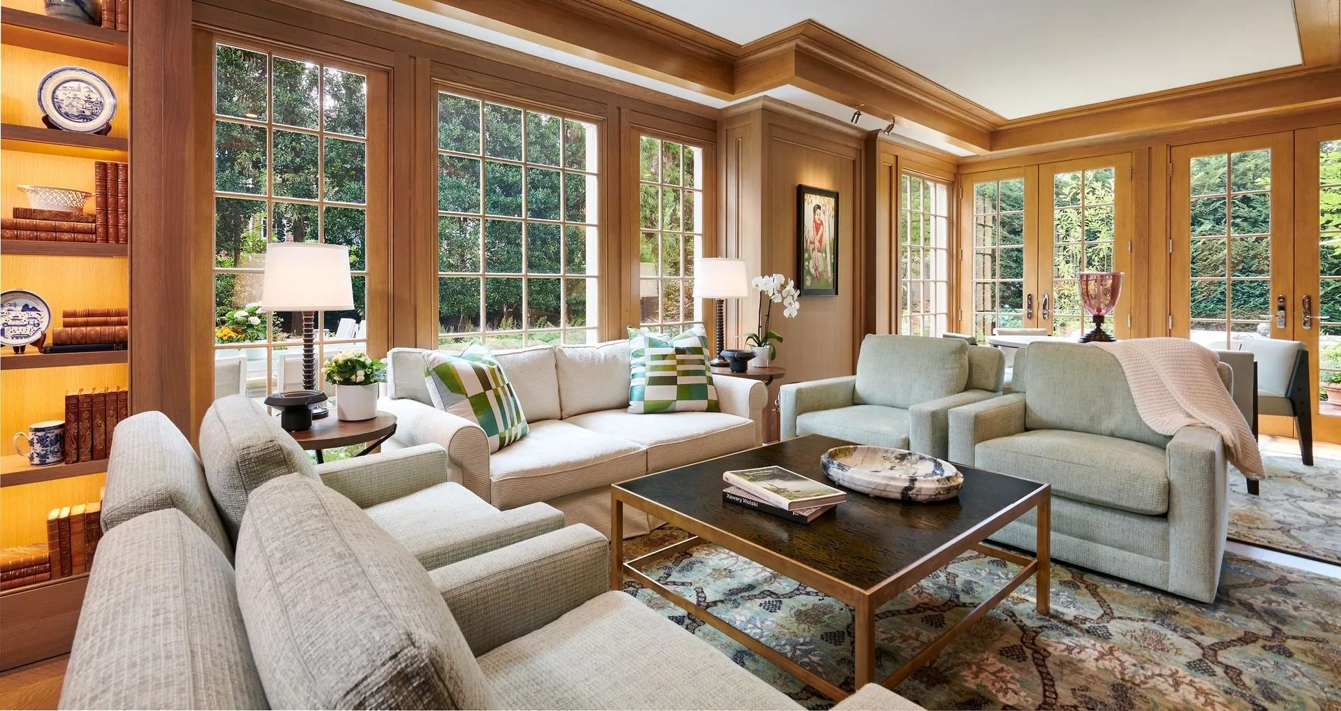
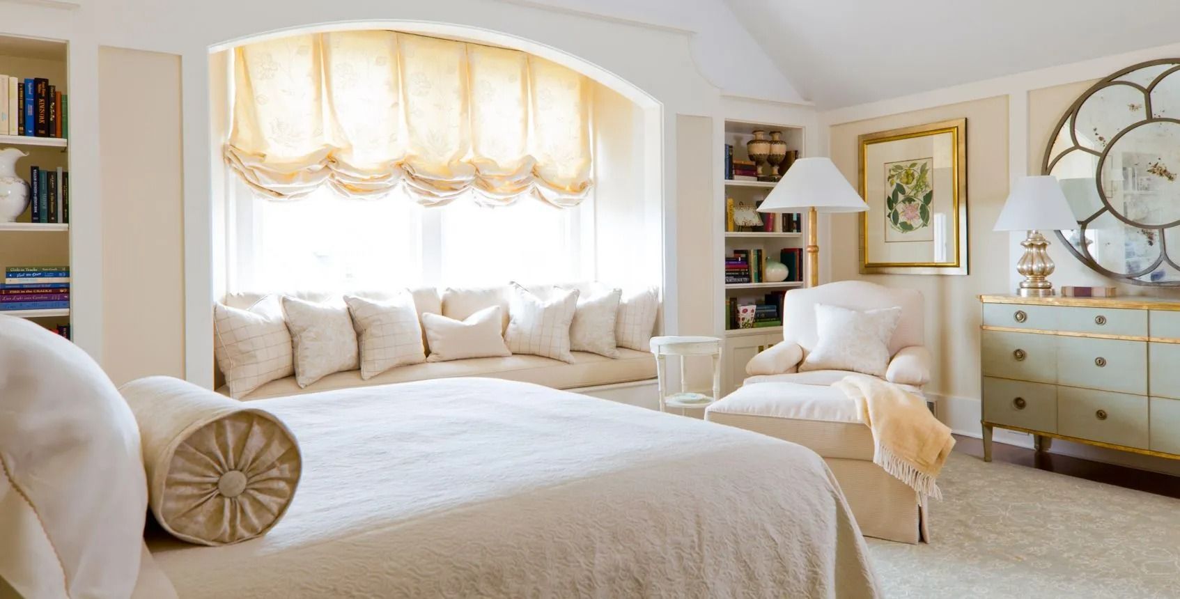
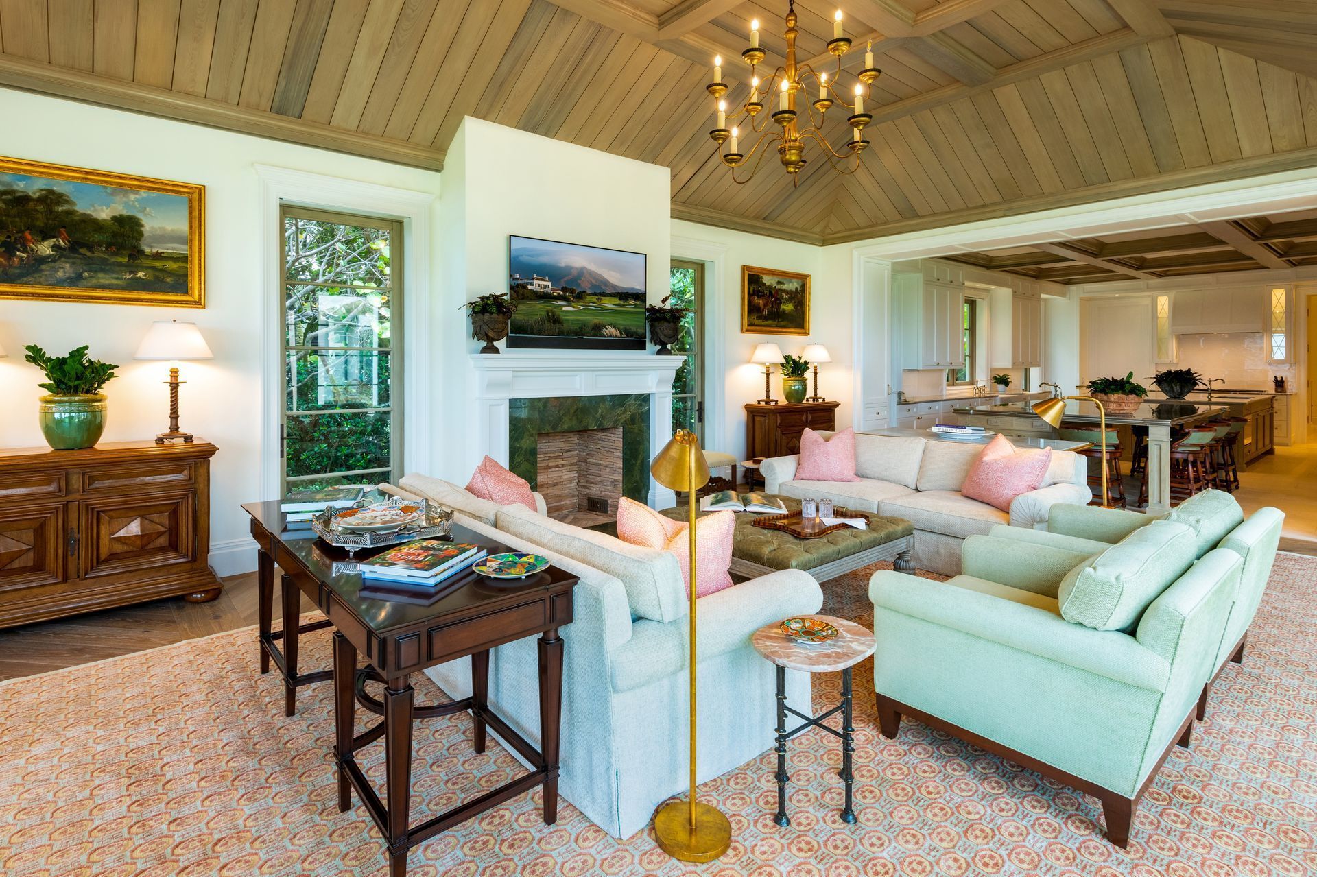
We often choose a soft, neutral palette as a foundation. Subtle gradations of tone and gentle shifts in texture convey sophistication without shouting for attention. Materials such as limestone, linen, and honed wood add tactile warmth and quiet luxury. Each choice encourages calm and continuity, connecting the inhabitant to the space in an intuitive way.


Furniture placement is equally important. Pieces are arranged to encourage easy conversation or peaceful solitude, depending on the purpose of the room. Pathways remain open, and every item has both a function and a reason for being there. This intentional simplicity invites comfort rather than austerity, creating a sense of openness that supports rest and reflection.


The Role of Light

Light defines mood more deeply than any other design element. In a quiet space, light should move slowly, revealing form rather than commanding it. Natural light filtered through sheer drapery creates a living softness that shifts throughout the day. It transforms as the hours pass, offering a quiet reminder of time’s rhythm. Artificial light, when layered thoughtfully, maintains that same balance between clarity and calm.


Soft pools of illumination from sconces, concealed fixtures, or table lamps offer intimacy. Rather than flooding a room with brightness, we prefer to shape light with purpose, allowing it to highlight texture, silhouette, and craftsmanship. When light and shadow exist in harmony, the room feels complete, grounded, and emotionally connected to the cycle of the day.


Texture and Atmosphere

The quietest spaces often speak through texture. A handwoven rug beneath bare feet, the matte surface of plaster, or the gentle sheen of silk each add dimension without noise. We layer these materials deliberately, ensuring that they complement rather than compete. Texture invites touch and awakens the senses while maintaining composure.


The presence of natural materials also strengthens a sense of tranquility. Stone, wood, and organic textiles remind us of the world beyond walls. They encourage grounding, connecting the inhabitant to something timeless and restorative. Even subtle imperfections, such as the irregular grain of wood or the slight color variation in hand-glazed tile, lend authenticity. These details tell a quiet story of craftsmanship and care.


The Human Element

True quiet arises not only from design but from the life that fills it. A quiet space should nurture rather than constrain. It should hold conversation comfortably and allow reflection without emptiness. We design with the understanding that stillness does not come from isolation, but from a thoughtful balance between activity and rest.


A well-designed quiet space restores its inhabitants in ways that extend beyond aesthetics. It becomes a place where one can think clearly, breathe deeply, and feel renewed. These spaces remind us that beauty and peace can coexist, that the most profound experiences of design often come not from abundance, but from the intentional pause.


Quiet spaces are, at their core, expressions of empathy. They acknowledge that the pace of life can be overwhelming and that beauty can be found in stillness. By designing rooms that soothe and steady, we offer more than visual comfort; we offer renewal, presence, and the quiet strength of simplicity.

February 3, 2026
Creating an interior that feels both engaging and calm requires careful balance. Too much visual stimulation can feel chaotic, while too much restraint can feel flat or unfinished. The goal is not to strip a space of character, but to shape it intentionally so that interest and simplicity work together rather than compete. Achieving this balance starts with understanding how people experience space on a daily basis. Why Visual Interest Matters Visual interest gives a space personality. It draws the eye, creates moments of discovery, and prevents interiors from feeling sterile. This interest can come from texture, contrast, scale, or thoughtful variation in materials. Without visual interest, a space may feel unfinished or overly utilitarian. People often respond to this by adding decor incrementally, which can lead to clutter rather than cohesion. Intentional design allows interest to be built into the structure of the space instead of relying on surface additions. Why Simplicity Is Essential Simplicity provides clarity. It allows the eye to rest and helps people feel grounded in a space. When too many elements compete for attention, even well chosen pieces can lose their impact. Simplicity does not mean minimalism. It means restraint . Each element has a reason for being present and contributes to the overall composition. When unnecessary elements are removed, the remaining ones become more powerful. Establishing a Clear Hierarchy One of the most effective ways to balance interest and simplicity is by establishing hierarchy . Not every element needs to be a focal point. Successful interiors often have one or two primary features supported by quieter secondary elements. This hierarchy guides how the space is read. The eye knows where to land first, then where to move next. Without this structure, interiors can feel visually noisy even when individual components are attractive. Using Texture Instead of Excess Texture is a powerful tool for creating interest without adding clutter. Subtle variation in materials such as wood grain, stone finishes, textiles, or wall treatments adds depth without overwhelming the space. Texture works best when it is layered thoughtfully. When too many textures are introduced at once, the effect can feel busy. Limiting the palette while varying surface quality allows interest to emerge naturally. Letting Negative Space Do Its Work Negative space is just as important as what is filled. Empty space allows design elements to breathe and gives visual weight to what remains. It also supports functionality by preventing interiors from feeling crowded or restrictive. Resisting the urge to fill every wall or surface often results in a more composed and comfortable environment. Negative space creates rhythm and balance, especially in rooms that serve multiple purposes. Color as a Unifying Element Color can either calm or energize a space depending on how it is used. A restrained color palette helps unify diverse elements and prevents visual fragmentation. Interest can still be introduced through variation in tone, saturation, or finish rather than constant color changes. When color is used strategically, it reinforces cohesion while allowing individual features to stand out in meaningful ways. Designing for Daily Use Spaces should support how people live and work, not just how they look. Visual interest that interferes with function quickly becomes a distraction. Simplicity helps interiors remain usable and comfortable over time. Designing with daily routines in mind ensures that interest enhances experience rather than competing with it. A Measured Approach Creates Lasting Design Balancing visual interest with simplicity is about intention. Every choice should support the whole rather than draw attention to itself unnecessarily. When design decisions are measured and purposeful, interiors feel both engaging and restful. The most successful spaces do not demand attention. They invite it naturally, offering richness without excess and clarity without monotony.
January 27, 2026
Every successful interior begins long before materials are selected or drawings are finalized. The foundation of an effective space is not a color palette or a furniture layout, but the quality of the questions asked at the outset of the project. Thoughtful questioning shapes decisions, clarifies priorities, and ultimately determines whether a space supports the people who use it or simply looks finished. Design that performs well over time is rooted in understanding, not assumptions. Questions Define the Problem Being Solved Design challenges are rarely as simple as they appear. A request for a refreshed interior may actually reflect deeper concerns about workflow, growth, culture, or usability. Without careful questioning, surface level solutions risk addressing symptoms rather than causes. Asking the right questions helps define what the project truly needs to accomplish. How is the space used throughout the day? Where do bottlenecks occur? What activities are growing or changing? These inquiries reveal functional requirements that may not be visible in an initial walkthrough. Clear problem definition prevents misalignment later in the process. Understanding People Before Spaces Interiors exist to support people, not the other way around. Asking better questions means learning how individuals and groups interact with their environment . This includes understanding routines, collaboration styles, privacy needs, and physical demands. When designers ask how people move, communicate, and focus within a space, layouts become more intuitive. Circulation improves. Work areas feel purposeful rather than arbitrary. These outcomes are the result of listening carefully rather than imposing predetermined solutions. Design informed by human behavior tends to feel effortless, even when it is highly intentional. Context Matters More Than Trends Trends can be useful references, but they are rarely a substitute for context. Asking better questions shifts the focus away from what is popular and toward what is appropriate. What is the lifespan of the space? How often will it change? What level of durability is required? What constraints exist that must be respected? These questions guide material selection, detailing, and planning decisions. They also help avoid design choices that age poorly or fail under real use conditions. Context driven design is less about visual novelty and more about long term relevance. Aligning Design With Organizational Goals Interior environments often reflect organizational values, whether intentionally or not. Asking better questions allows design to align with broader goals such as productivity, collaboration, inclusivity, or client experience. What behaviors should the space encourage? What impression should it leave? How should it support future growth? These considerations influence everything from spatial hierarchy to lighting strategy. When design decisions are connected to organizational purpose, the result feels cohesive and intentional. Reducing Rework and Uncertainty Clear questions at the beginning reduce costly changes later. When priorities are defined early, design development becomes more efficient. Fewer assumptions mean fewer revisions driven by late discoveries. Asking better questions also helps clients articulate preferences they may not initially know how to express. This shared understanding builds confidence and reduces decision fatigue as the project progresses. Clarity early in the process saves time, resources, and frustration. Design as a Collaborative Process Successful interiors emerge from collaboration rather than prescription. Asking thoughtful questions invites dialogue and shared ownership. It positions design as a process of discovery rather than a fixed solution delivered from outside. This approach respects the expertise of those who know the space best while applying professional insight to translate needs into form. Collaboration strengthens outcomes because it grounds creativity in reality. Better Questions Lead to Better Results Design is often judged by what is visible, but its success is determined by what is understood. Spaces that function well over time are the result of careful listening, thoughtful inquiry, and deliberate choices. By prioritizing better questions at the beginning of a project, interiors gain clarity, purpose, and longevity. The result is not just a well designed space, but one that continues to support its users long after completion.  In the end, the quality of the questions asked shapes the quality of the space that follows.
January 20, 2026
Every interior space communicates information, whether intentionally or not. People instinctively read a room as soon as they enter it, identifying where to go, what matters most, and how they are meant to move through the environment. Visual hierarchy is the design principle that shapes this experience. When applied thoughtfully, it helps spaces feel intuitive, balanced, and purposeful rather than confusing or overwhelming. What Visual Hierarchy Really Means Visual hierarchy refers to the order in which elements within a space attract attention. Some features naturally stand out first, while others recede into the background. This order is influenced by scale, contrast, placement, light, and material choice. A strong hierarchy does not demand attention through excess. Instead, it guides the eye calmly and logically, allowing occupants to understand the space without conscious effort. Why Hierarchy Matters in Interior Design Without a clear hierarchy, spaces can feel disorganized even when they are technically well designed. When everything competes for attention, nothing feels resolved. This can lead to visual fatigue and uncertainty about how the space should be used. Clear hierarchy supports usability . It helps occupants identify primary functions, circulation paths, and focal areas. In professional environments, it also supports efficiency by reducing hesitation and unnecessary movement. Scale and Proportion as Foundational Tools Scale is one of the most effective ways to establish hierarchy. Larger elements naturally draw attention first. This might include a reception desk, a central conference table, or a prominent wall plane. Proportion reinforces scale by creating contrast between major and minor elements. When proportions are balanced, important features feel intentional rather than oversized. Supporting elements then fall into place without competing visually. The Role of Light in Guiding Attention Light plays a powerful role in hierarchy . Brightly lit areas attract the eye, while dimmer zones recede. This can be achieved through natural light, artificial lighting, or a combination of both. Highlighting key areas such as entrances, gathering points, or circulation nodes helps people understand how the space functions. Consistent lighting in secondary areas supports clarity without distraction. Material and Color as Hierarchical Signals Material changes can quietly signal importance. A shift from one surface finish to another often marks a transition in function or priority. Similarly, restrained use of color contrast can draw attention where needed without overwhelming the environment. Hierarchy does not require bold color statements. Subtle variation often creates a more refined result, especially in professional interiors where longevity matters. Circulation and Spatial Flow Hierarchy is not limited to what people see, it also influences how they move. Clear circulation paths help users understand where to go next. When circulation is visually reinforced through alignment, lighting, or material continuity, movement becomes intuitive. Spaces that lack clear circulation hierarchy may feel cramped or inefficient, even if square footage is adequate. Supporting Elements Should Support Secondary elements such as storage, support spaces, and utilities should be visually quiet. Their role is to function well without competing for attention. When secondary elements are over designed, they disrupt hierarchy and distract from the primary purpose of the space. Intentional restraint allows the most important features to stand out naturally. Designing for Clarity Over Time A well established hierarchy ages better than trend driven design. When hierarchy is based on function and spatial logic rather than decorative emphasis, the space remains legible even as furnishings or uses evolve. This approach supports long term adaptability and reduces the need for frequent redesign. A Deliberate Approach to Interior Order Visual hierarchy is about clarity, not control. It respects how people naturally experience space and supports them through subtle guidance.  We approach interior environments with hierarchy as a foundational principle. By carefully balancing scale, light, material, and flow, we create spaces that communicate clearly and perform effectively without unnecessary complexity.